This blog post outlines some detail on the tools I am now using to build my prototypes, including why I am using them, and concludes with a recent app example combining Snap.svg and Vue.js to connect data in real time with deepstreamHub.
SVG + Snap.svg
The choice for using Scalable Vector Graphics (SVG) and Snap.svg is very simple, it’s to support the visualisation of the data. In my instance, this data is learning objects. (documents, links, slides etc.) The aim is to take this data into artifacts that can then be manipulated via a spatial interface. Move, connect and combine.

SVG allows the concept I have of relationships, distances and zoomability that I want to experiment with.

The SVG format by default ensures device indifference and thus scalability and visibility options on small, large and mobile screens are easier to accommodate.
SVG is an excellent way to create interactive, resolution-independent vector graphics that will look great on any size screen. And the Snap.svg JavaScript library makes working with your SVG assets as easy as jQuery makes working with the DOM. – snapsvg.io
Mobile screens are everywhere alongside large format screens and projection within our teaching studios. The accessibility and usability of any tool has to be built into its defaults. Choosing good defaults is a major design consideration that I will be working hard to get right, such as by default accessible and responsive.
Vue.js
Vue.js was found after a series of conversations and previous considerations around my choices for the programming language I wished to settle on.
I initially starting my investigations with Go (golang) and then moved to Swift before ending up with Vue.js.
Vue (pronounced /vjuː/, like view) is a progressive framework for building user interfaces. Unlike other monolithic frameworks, Vue is designed from the ground up to be incrementally adoptable. The core library is focused on the view layer only, and is easy to pick up and integrate with other libraries or existing projects. On the other hand, Vue is also perfectly capable of powering sophisticated Single-Page Applications when used in combination with modern tooling and supporting libraries.
I initially looked at Go (this blog is running on Go in fact) because the details I understood about the way the programming language was designed and the integration of front end and server side technology sounded great. It was also a web focussed technology and my thoughts have always focussed on the web due to its open standards and ethos. However, Google created Go and this certainly contradicts the ethical ethos the project will take on data, which I felt was problematic. Go also didn’t really progress where I had hoped in terms of front end abilities. Then finally after attending a UK golang conference, I found I was so confused with the details in part I think due to the fact Go was much further into Computer Science and large scale application design than I am or was prepared to deal with.
Another choice that started to emerge at a similar time was Swift. Again the background to the language was exciting. Another decision in this project is to be design-led and thus adhere to design principles within the manifesto. Principles such as those you can associate with the design ethos at Apple. Apple created Swift for its own development purposes and could perhaps thus help support this aim. Apple have good, detailed Human Interface Guidelines and make a number of design affordances I certainly consider as best practice. So much like with Go I played and built a few Swift prototypes both for macOS and iOS which in fact went very well. I also invested in the latest Paintcode app which can take UI elements directly into the latest Swift Code using a Sketch app like interface.
However, Swift was not without a number of concerns. Although Swift was made open source, the platform for deployment iOS and macOS is not open. At some point, I had convinced myself that the implementation of my tool on macOS and iOS would work as an exemplar of my manifesto. And I felt that as my exemplar used a design-led platform, iOS and macOS, others could just follow this lead and read the manifesto for conversion to other platforms.
However another major issue arose in our studios, the fact that many students I would work with to test my tool use Windows and Android in general. So, my ability to test my tool, my exemplar, in the live education studio would be very limited if built in Swift. This was a bad decision: the project is human centred and making my tool much more intuitive and delightful but not being able to robustly test choices in depth would in the end hamper my design decisions.
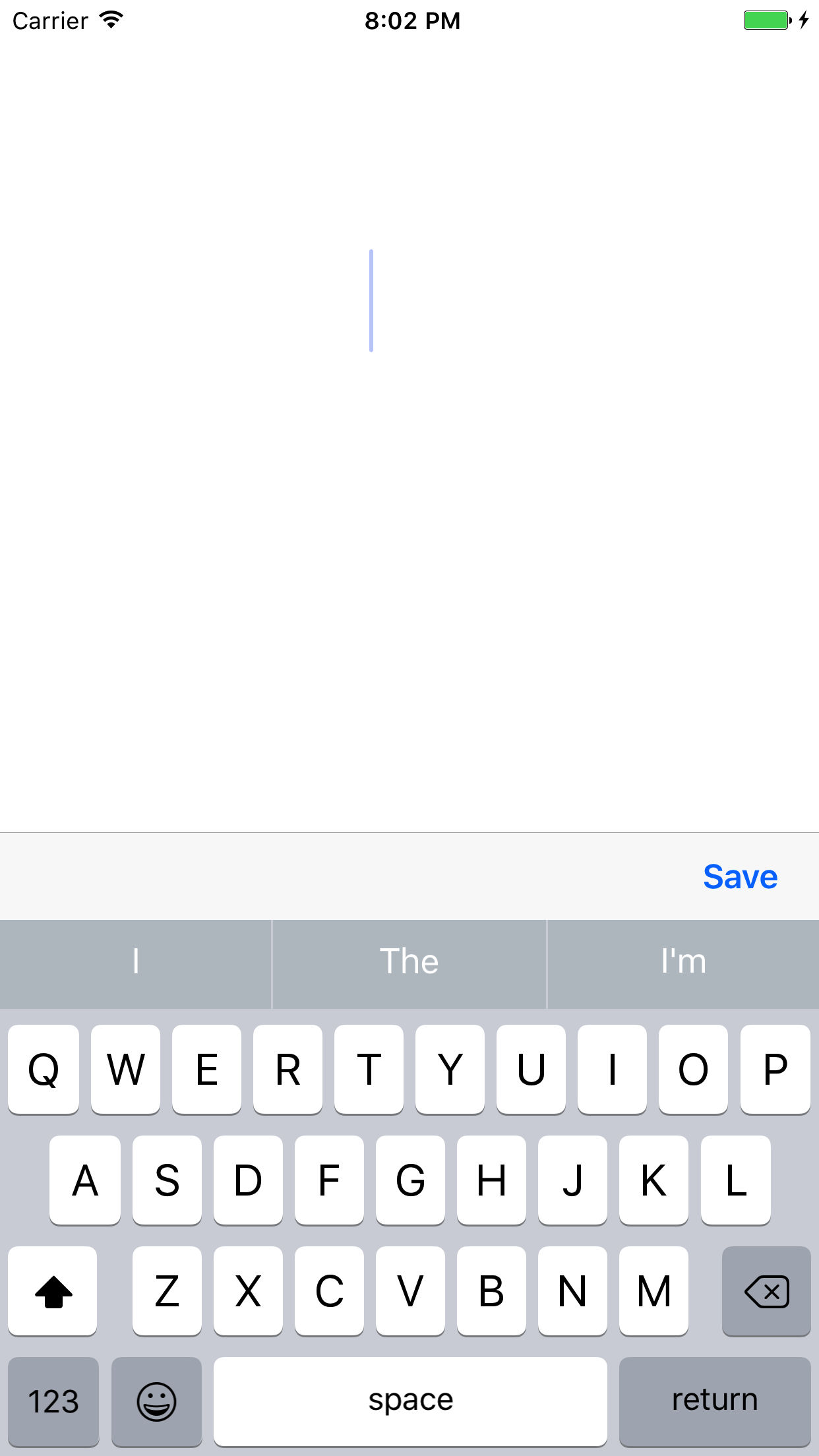
The final nail in the Swift coffin was the rejection 1 from the App Store of my Swift App “SaveIT”.
This was a clear indication that the gate keeper of the App Store, Apple, may have future issues with my design choices and may not leave me free to dictate “delightful” design choices, another area my research is focussed on investigating and defining.
This further cemented the fact I hadn’t reconciled my desire for an open project and open platform and so the web came calling back. I know and have much more experience on web tech and coding than I do in “real programming”. And alongside a host of websites, web based tools I have made numerous web “apps”. Why had I not stayed on this course!
However, I was wary, as web apps are problematic; at the very least they are not native. I have tried in the past most known tools, like Titanium and Apache Cordova but was never that happy with them. They also tended to limit design to mobile and try to ape a native app and thus have structures and features that would be odd and possibly inaccessible on a desktop browser. I did however keep thinking about Javascript. But I knew I didn’t want JQuery or JQuery Mobile, I’d been there before.
So, I started scouting around for newer web tech with my project in mind, at some point in discussing a number of the above processes and choices it was recommended I look at Angular and React. Both had moved on since I had last viewed them and had matured significantly. I was not totally sure but a good test for me is “how quick can I get something up and running…”
To be brutally honest I was totally confused and got nowhere fast. Using Angular and React seemed a much higher barrier to entry than Swift or even Go had been. Yet in this futile attempt and scouting exercise I in fact stumbled into Vue.js and as an aside (for now) Electron.
Vue.js was so quick to understand and the more I read reviews and discussed it the more excited I became. My previous blog post which showed a markdown editor I built from a Vue.js example was so fast to get up and running and tweakable I was pleasantly surprised. This also revealed to me that the data could be formatted towards JSON. This is major. If my tool is to be decentralised again dictated by my manifesto I needed a highly portable, lightweight data structure. My previous considerations of local sync with MYSQL via blockchain style methods such as Syncthing or Etherium disappeared as a concern. This is a complicated technology and with Swift I had even considered to just not implement the blockchain part of my exemplar hoping someone might fill that gap as time went on, another poor choice. Go had at least offered flat data files as a nice light weight option and I did get 3 party sync working with IPFS but it was far from easy.
Vue.js just started to make total sense.
- Web Tech (HTML,CSS, JS)
- Easy to use
- JSON style Data
A number of things lined up and so then I looked at how I could network the JSON style data from Vue.js across devices, which is when I located deepstreamHub.
next generation realtime deepstreamHub enables enterprises to sync persistent data between millions of devices within milliseconds
This sounded good. The data was also in JSON and there was another great tutorial on Vue.js showing how to connect to deepstreamHub. I hooked up my Vue.js app to the deepstreamHub and was able again quickly to take my previous single device markdown prototype and store and sync the data with deepstreamHub across multiple devices!
deepstream is an open source server inspired by concepts behind financial trading technology.
Although I was testing on the deepstreamHub cloud and it just worked, knowing that deepstream itself was also open source and could run on a standard web server added to the excitement.

Finally the Demo
I know I need to experiment with a spatial interface. My research into spatial hypertext and other conversations, at places like The Future of Text conference, have solidified this. With the initial simple demo up and running it became obvious that I should be able to take position data from objects and store this as JSON in real time with Vue.js and deepstreamHub.
So this brings us right back to SVG and Snap.svg as I was able to use this with Vue.js to create an artefact that I could drag around.2.
I could then take the position data of this SVG object into deepstreamHub.
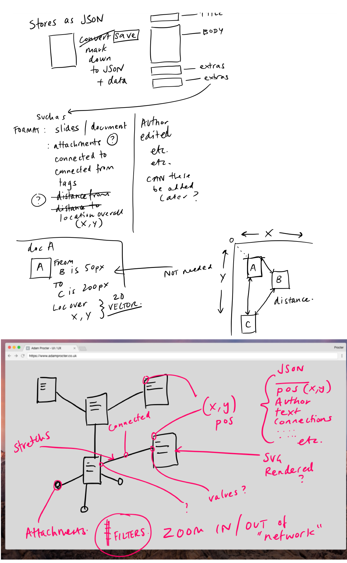
But not only the position for the artefact it could contain the owner, the title, the actual markdown text of the artefact and in fact any associated connections, relationships or tags that could be needed to make this a truly networkable learning object. I could even add data to the object after if there was a need to add in additional functions.
I am pretty excited about getting to where I am with a practical demo this quickly around some of my initial ideas. However, I did get a little stuck in the final pieces of the data puzzle and may need to rethink exactly how best to store and real time sync the data but I have the tools that I believe will offer the answer, so long as my skills can match up to the challenge. The good news is that so far, that seems to be the case!
Please join the conversation about this below and feel free to examine all my code here.
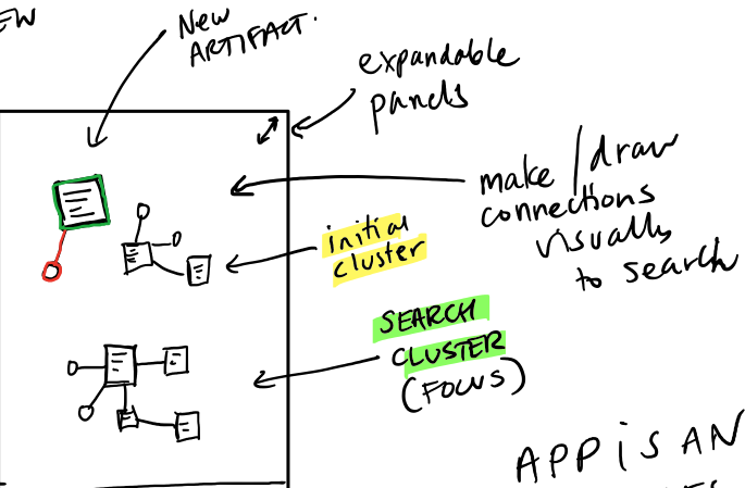
A lot of the thinking work I undertake for all of this is recorded as scribbles in OneNote and via conversations with others. Here are some of the more recent scribbles to give you a little sneak peek into this part of the process.

Why was SaveIT Rejected?
SaveIT is a very simple app designed to allow you to really quickly capture thoughts. The app uses iOS and Mac OS Reminders as the default store to capture your ideas and then you can do what you like with them.
Use SaveIT to capture thoughts in a fast none intrusive and delightful manner.

Apple Rejected my app based on the guidelines 4.2 which in essence is;
Your app should include features, content, and UI that elevate it beyond a repackaged website. If your app is not particularly useful, unique, or “app-like,” it doesn’t belong on the App Store. – Apple Guidelines
The rejection email asked for a new app concept.
Design – 4.2
We found that the usefulness of your app is limited by the minimal amount of content or features it includes.
Next Steps
We encourage you to review your app concept and incorporate different content and features that are in compliance with the App Store Review Guidelines. – Apple
I replied to justify my design choices.
Please can you reconsider my app. The app is minimal yes however this is a major design decision. The concept is based on the experience of when ideas come to mind or you are prompted with something you need to do later. I want and I believe others do need a distraction free way to get this thought / to do into a reliable system that you can process later. This concept is based on the “Get Things Done” principle to get these things out of your head and into a system.
The Reminders app on iOS and Mac does provide a similar function. However there are two distractions. Instantly one is the list of other things you have in the system. This cognitively shouldn’t be under estimated, and may distract the thought you are having and the same action in Reminders versus Save It is 3 steps not 1. There is an app Later within the store that provides a similar ethos however it uses a proprietary storage system where as I felt that using the iCloud eco system made much more sense. So I would also argue that their app provides less functionality as it requires a 3rd party subscription.
I could not have made this as a web app to connect to the iCloud calendar store.
The interface is designed to be unobtrusive and provide the user with a moment of delight through simplification.
This was met with a shorter rejection.
In order for us to continue the review of your app, it would be appropriate to consider the 4.2 App Store Review guideline and resubmit a new binary. – Apple
Not so good. ↩
Accessible web player from http://ind.ie↩