
Information Design & Data Visualisation
The following post aims to lay out the ground work as to why the application of the guiding principles of information design & data visualisation should be applied to a design manifesto for a design led learning system (DLS).
The skills that information designers possess are arguably the most important in the design industry. Without them we cannot understand new ideas, and if we cannot understand we cannot learn and if we cannot learn we perish. (Eye Magazine #78 p100 2010)
Today we are able to obtain and provide a wealth of data on a daily basis. We occupy a world where this data can be utilised in ways that could be great:
Our Future depends on finding answers in data. Climate Science, economic and genetics all present us with problems that are solvable in part through the right visualisation of their complexity. (Eye Magazine #78 p100 2010)
or it could be terrifying:
I don’t want to live in a world where there’s no privacy, and therefore no room for intellectual exploration and creativity. (Snowden, Citizen Four, 2014)
A managed learning environment is a collection of resources, in our instance related to Art & Design teaching and learning — this is our data.
How this data is organised and presented is a key factor in the design of such an environment. To understand how we may apply this we will first take a look at information design in a broad sense. Then a subsequent post will look at the history and application within human computer interaction and the ways that people have overcome the challenges of presenting such data. By taking a historical perspective we may find new references and results for different futures:
Ideally, simplification means making the content (the product, the system or the rules) simpler but often all we want to do is present it in a way that is easier to use and understand. (Simplification Centre, 2010) [Centre for Information Design Research]
So for a moment lets apply some basic simplification to a set of learning materials likely to be needed for tutors and students within a managed learning environment for an Art & Design project are as follows. For example:
- Timetable
- Scheme of Work
- Detailed Session Plan
- Slides (launches / information)
- Project Brief
- Workshop Materials Outline
- Videos / Training Videos
- Links (URL’s)
- Reading list
We will keep this as a list of our core data.
Data Decoration
What we are not concerned with is data decoration
(Mollerup, 2014) and so it is clear to lay down issues within this field and pin point the principles of information design.
The terms data and information are often used synonymously, but it’s important to differentiate between the two. Data holds no meaning on its own, it’s through the process of interpretation and the assignment of meaning that data becomes information. (InformForm, 2012)
The world of infographics as represented in the best selling book Information is Beautiful (David McCandless) claims to show how visualised information can help us comprehend, navigate and find meaning in a complex world
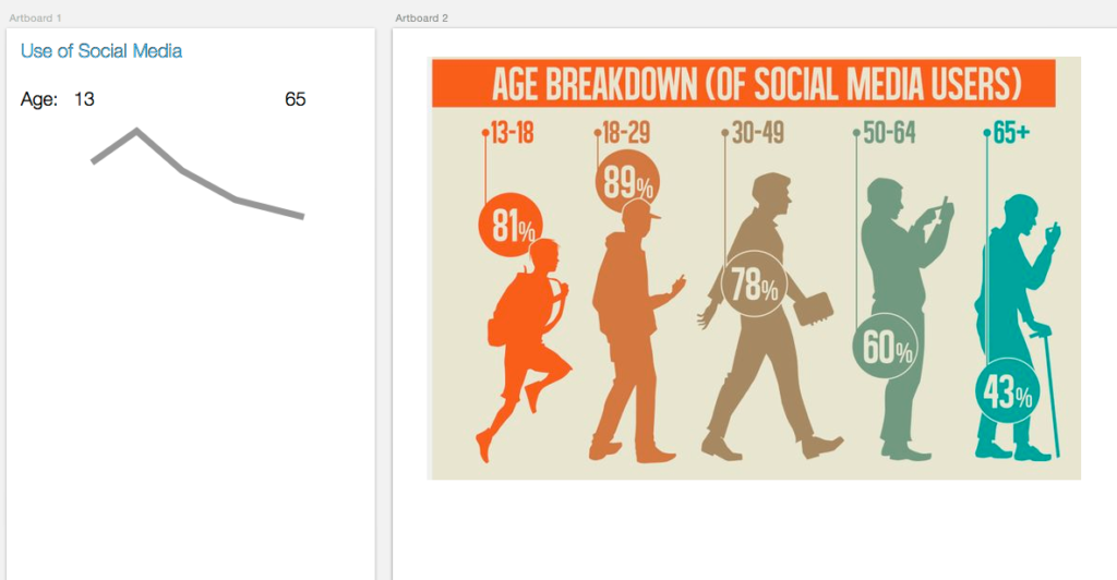
. However what tends to happen is that many designers seem to fall into the category of visualising information to look ‘really cool’ without what appears to be any consideration for the data or the audience. Here is a typical board of infographics. These visualisations serve very little purpose in actually helping the audience to better understand the data, they do very little beyond making it ‘look pretty’; they do not consider the forms intent.
Perhaps a sparkline2would suffice, providing the same level of information but where simplification allows quick decoding of the data. For example:
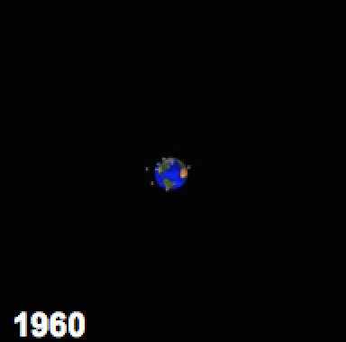
There is a mismatch between visualisation and purpose; in fact simply making the information beautiful can degrade or distract from the value of the data. However when data is represented in a clear way it can open understanding and perhaps even action. As of 2009 there are currently 19,000 objects in orbit around the earth, 95% is debris (2009, NASA)
is a meaningless piece of data but without a lot more text and background you would not gain insight as quickly as you do with the following animated GIF.
Something to note for future discussion is that the world of information design is starting to unlock the potential for contextual knowledge built on data combinations that allow rapid user responses to data.
Instead of data visualisation, Felton imagines a future built upon pure insight. No one needs to see a weather radar, he contends, when all you really want to know is whether or not you need an umbrella. (Fast Co Design, 2015)
Context driven design is seamless and almost transparent, a recent update to the app Dark Sky enables custom notifications on the weather conditions to prompt the user to take action without the need to ever view the user interface (UI); the Apple WATCH Glances offer a similar option.
A new network
As knowledge increases amongst mankind, and transactions multiply, it becomes more and more desirable to abbreviate and facilitate the modes of conveying information from one person to another, and from one individual to many (Playfair, 1786)
By unlocking learning data via the guiding principles of information design, there is the potential to realise and discover new avenues of making and thinking. The application of this principle within an networked environment that caters for and nurtures a learning network (Watters, 2015) via a set of ‘starter’ materials has the opportunity to unlock ideas that we have yet to realise.
If, as some argue, learning networks are powerful new ways for us to organise and share as learners, then we must consider how we can build and wield them (Watters, 2015)
The next post will look at the concept of data visualisation specifically within the historical context of the Augmentation Research Centre (ARC), Xerox PARC and other iconic research centres. The post will focus on the design experiments and concepts related specifically to the direct manipulation of data via the Graphical User Interface (GUI).
Data by itself is not enough, data needs poetry (Dawes, 2013)
Feedback welcome. Tweet / follow me @adamprocter
References
- Anon, 2010. Eye Magazine #78,
- Citizen Four, 2014. Film. Directed by Laura Poitras. Germany: Praxis Films.
- Anon, 2011. Our first two years: 2009–10. pp.1–16.
- Mollerup, P., 2015. Data Design, Bloomsbury Publishing.
- Anon, 2012. InformForm.
- Anon, 2009. The Threat of Orbital Debris and Protecting NASA Space Assets from Satellite Collisions. pp.1–14.
- Wilson, What Killed The Infographic? Available at: FastCo.
- Playfair, 1786
- Watters, Learning Networks, Not Teaching Machines. Available at: HackEducation.
- Dawes, Data by itself is not enough, data needs poetry. Available at: YouTube
Illustration by Jade Carter↩A sparkline is a very small line chart, typically drawn without axes or coordinates. It presents the general shape of the variation in some measurement.↩