Prototypes Nov 2017

This blog post outlines some detail on the tools I am now using to build my prototypes, including why I am using them, and concludes with a recent app example combining Snap.svg and Vue.js to connect data in real time with deepstreamHub.

SVG + Snap.svg

The choice for using Scalable Vector Graphics (SVG) and Snap.svg is very simple, it’s to support the visualisation of the data. In my instance, this data is learning objects. (documents, links, slides etc.) The aim is to take this data into artifacts that can then be manipulated via a spatial interface. Move, connect and combine.

SVG allows the concept I have of relationships, distances and zoomability that I want to experiment with.

The SVG format by default ensures device indifference and thus scalability and visibility options on small, large and mobile screens are easier to accommodate.

SVG is an excellent way to create interactive, resolution-independent vector graphics that will look great on any size screen. And the Snap.svg JavaScript library makes working with your SVG assets as easy as jQuery makes working with the DOM. – snapsvg.io

Mobile screens are everywhere alongside large format screens and projection within our teaching studios. The accessibility and usability of any tool has to be built into its defaults. Choosing good defaults is a major design consideration that I will be working hard to get right, such as by default accessible and responsive.

Vue.js

Vue.js was found after a series of conversations and previous considerations around my choices for the programming language I wished to settle on.

I initially starting my investigations with Go (golang) and then moved to Swift before ending up with Vue.js.

Vue (pronounced /vjuː/, like view) is a progressive framework for building user interfaces. Unlike other monolithic frameworks, Vue is designed from the ground up to be incrementally adoptable. The core library is focused on the view layer only, and is easy to pick up and integrate with other libraries or existing projects. On the other hand, Vue is also perfectly capable of powering sophisticated Single-Page Applications when used in combination with modern tooling and supporting libraries.

I initially looked at Go (this blog is running on Go in fact) because the details I understood about the way the programming language was designed and the integration of front end and server side technology sounded great. It was also a web focussed technology and my thoughts have always focussed on the web due to its open standards and ethos. However, Google created Go and this certainly contradicts the ethical ethos the project will take on data, which I felt was problematic. Go also didn’t really progress where I had hoped in terms of front end abilities. Then finally after attending a UK golang conference, I found I was so confused with the details in part I think due to the fact Go was much further into Computer Science and large scale application design than I am or was prepared to deal with.

Another choice that started to emerge at a similar time was Swift. Again the background to the language was exciting. Another decision in this project is to be design-led and thus adhere to design principles within the manifesto. Principles such as those you can associate with the design ethos at Apple. Apple created Swift for its own development purposes and could perhaps thus help support this aim. Apple have good, detailed Human Interface Guidelines and make a number of design affordances I certainly consider as best practice. So much like with Go I played and built a few Swift prototypes both for macOS and iOS which in fact went very well. I also invested in the latest Paintcode app which can take UI elements directly into the latest Swift Code using a Sketch app like interface.

However, Swift was not without a number of concerns. Although Swift was made open source, the platform for deployment iOS and macOS is not open. At some point, I had convinced myself that the implementation of my tool on macOS and iOS would work as an exemplar of my manifesto. And I felt that as my exemplar used a design-led platform, iOS and macOS, others could just follow this lead and read the manifesto for conversion to other platforms.

However another major issue arose in our studios, the fact that many students I would work with to test my tool use Windows and Android in general. So, my ability to test my tool, my exemplar, in the live education studio would be very limited if built in Swift. This was a bad decision: the project is human centred and making my tool much more intuitive and delightful but not being able to robustly test choices in depth would in the end hamper my design decisions.

The final nail in the Swift coffin was the rejection 1 from the App Store of my Swift App “SaveIT”.

This was a clear indication that the gate keeper of the App Store, Apple, may have future issues with my design choices and may not leave me free to dictate “delightful” design choices, another area my research is focussed on investigating and defining.

This further cemented the fact I hadn’t reconciled my desire for an open project and open platform and so the web came calling back. I know and have much more experience on web tech and coding than I do in “real programming”. And alongside a host of websites, web based tools I have made numerous web “apps”. Why had I not stayed on this course!

However, I was wary, as web apps are problematic; at the very least they are not native. I have tried in the past most known tools, like Titanium and Apache Cordova but was never that happy with them. They also tended to limit design to mobile and try to ape a native app and thus have structures and features that would be odd and possibly inaccessible on a desktop browser. I did however keep thinking about Javascript. But I knew I didn’t want JQuery or JQuery Mobile, I’d been there before.

So, I started scouting around for newer web tech with my project in mind, at some point in discussing a number of the above processes and choices it was recommended I look at Angular and React. Both had moved on since I had last viewed them and had matured significantly. I was not totally sure but a good test for me is “how quick can I get something up and running…”

To be brutally honest I was totally confused and got nowhere fast. Using Angular and React seemed a much higher barrier to entry than Swift or even Go had been. Yet in this futile attempt and scouting exercise I in fact stumbled into Vue.js and as an aside (for now) Electron.

Vue.js was so quick to understand and the more I read reviews and discussed it the more excited I became. My previous blog post which showed a markdown editor I built from a Vue.js example was so fast to get up and running and tweakable I was pleasantly surprised. This also revealed to me that the data could be formatted towards JSON. This is major. If my tool is to be decentralised again dictated by my manifesto I needed a highly portable, lightweight data structure. My previous considerations of local sync with MYSQL via blockchain style methods such as Syncthing or Etherium disappeared as a concern. This is a complicated technology and with Swift I had even considered to just not implement the blockchain part of my exemplar hoping someone might fill that gap as time went on, another poor choice. Go had at least offered flat data files as a nice light weight option and I did get 3 party sync working with IPFS but it was far from easy.

Vue.js just started to make total sense.

  • Web Tech (HTML,CSS, JS)
  • Easy to use
  • JSON style Data

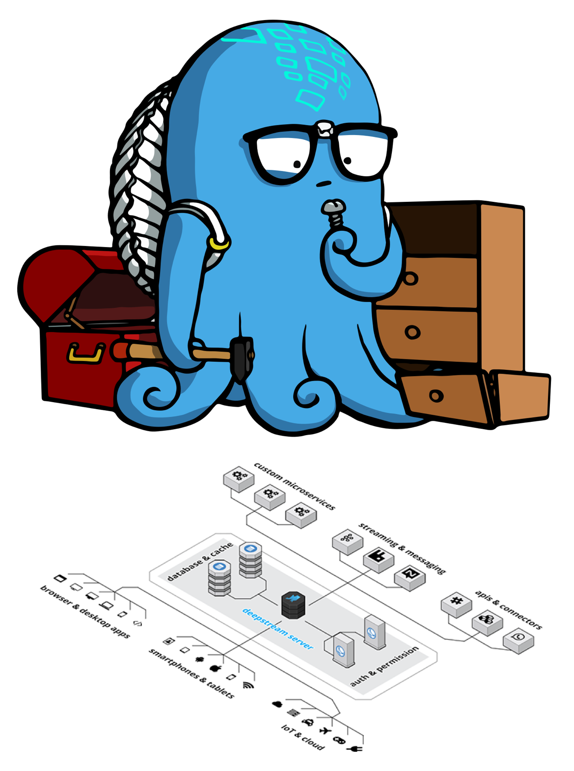
A number of things lined up and so then I looked at how I could network the JSON style data from Vue.js across devices, which is when I located deepstreamHub.

next generation realtime deepstreamHub enables enterprises to sync persistent data between millions of devices within milliseconds

This sounded good. The data was also in JSON and there was another great tutorial on Vue.js showing how to connect to deepstreamHub. I hooked up my Vue.js app to the deepstreamHub and was able again quickly to take my previous single device markdown prototype and store and sync the data with deepstreamHub across multiple devices!

deepstream is an open source server inspired by concepts behind financial trading technology.

Although I was testing on the deepstreamHub cloud and it just worked, knowing that deepstream itself was also open source and could run on a standard web server added to the excitement.

Finally the Demo

I know I need to experiment with a spatial interface. My research into spatial hypertext and other conversations, at places like The Future of Text conference, have solidified this. With the initial simple demo up and running it became obvious that I should be able to take position data from objects and store this as JSON in real time with Vue.js and deepstreamHub.

So this brings us right back to SVG and Snap.svg as I was able to use this with Vue.js to create an artefact that I could drag around.2.

I could then take the position data of this SVG object into deepstreamHub.

But not only the position for the artefact it could contain the owner, the title, the actual markdown text of the artefact and in fact any associated connections, relationships or tags that could be needed to make this a truly networkable learning object. I could even add data to the object after if there was a need to add in additional functions.

I am pretty excited about getting to where I am with a practical demo this quickly around some of my initial ideas. However, I did get a little stuck in the final pieces of the data puzzle and may need to rethink exactly how best to store and real time sync the data but I have the tools that I believe will offer the answer, so long as my skills can match up to the challenge. The good news is that so far, that seems to be the case!

Please join the conversation about this below and feel free to examine all my code here.

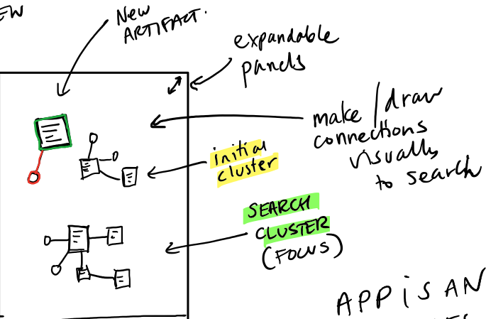
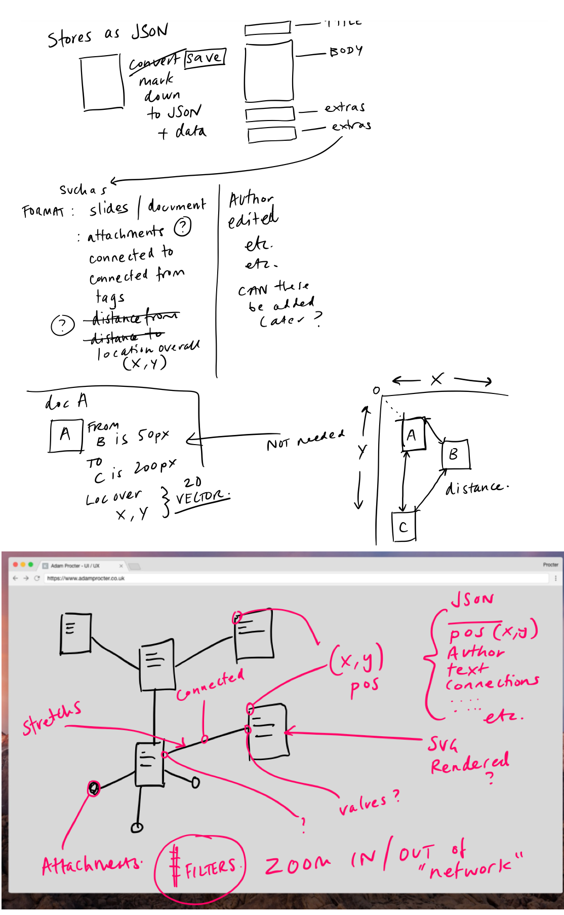
A lot of the thinking work I undertake for all of this is recorded as scribbles in OneNote and via conversations with others. Here are some of the more recent scribbles to give you a little sneak peek into this part of the process.


  1. Why was SaveIT Rejected?

    SaveIT is a very simple app designed to allow you to really quickly capture thoughts. The app uses iOS and Mac OS Reminders as the default store to capture your ideas and then you can do what you like with them.

    Use SaveIT to capture thoughts in a fast none intrusive and delightful manner.

    Apple Rejected my app based on the guidelines 4.2 which in essence is;

    Your app should include features, content, and UI that elevate it beyond a repackaged website. If your app is not particularly useful, unique, or “app-like,” it doesn’t belong on the App Store. – Apple Guidelines

    The rejection email asked for a new app concept.

    Design – 4.2

    We found that the usefulness of your app is limited by the minimal amount of content or features it includes.

    Next Steps

    We encourage you to review your app concept and incorporate different content and features that are in compliance with the App Store Review Guidelines. – Apple

    I replied to justify my design choices.

    Please can you reconsider my app. The app is minimal yes however this is a major design decision. The concept is based on the experience of when ideas come to mind or you are prompted with something you need to do later. I want and I believe others do need a distraction free way to get this thought / to do into a reliable system that you can process later. This concept is based on the “Get Things Done” principle to get these things out of your head and into a system.

    The Reminders app on iOS and Mac does provide a similar function. However there are two distractions. Instantly one is the list of other things you have in the system. This cognitively shouldn’t be under estimated, and may distract the thought you are having and the same action in Reminders versus Save It is 3 steps not 1. There is an app Later within the store that provides a similar ethos however it uses a proprietary storage system where as I felt that using the iCloud eco system made much more sense. So I would also argue that their app provides less functionality as it requires a 3rd party subscription.

    I could not have made this as a web app to connect to the iCloud calendar store.

    The interface is designed to be unobtrusive and provide the user with a moment of delight through simplification.

    This was met with a shorter rejection.

    In order for us to continue the review of your app, it would be appropriate to consider the 4.2 App Store Review guideline and resubmit a new binary. – Apple

    Not so good.

  2. Accessible web player from http://ind.ie

Markdown Prototype v0.4

Early days

Below is an image from my Marvel prototype I was playing with at the end of last academic term followed by a very early prototype built this past week in vue.js around the markdown entry system my app will need.

Accessible web player from http://ind.ie

Slack Workshop Proposal

Slack Workshop Proposal

Below follows my submission to Digitally Engaged Learning Conference 2017. It didn’t make the cut and was given useful feedback however I would like to take the idea somewhere or at least elicit some wider feedback, so feel free to join the conversation below. I will also be attending DeL so feel free to say hello.

Slack for Education

How does your session address the theme (100)

Many of our conversations and discussions now take place on digital platforms. Slack as they put it is “Team communication for the 21st century”. Over the past three years we have been using Slack as a tool for tutors and students to actively share their own research, materials, related exhibitions and events and discuss projects as they are happen. Slack allows tutors and students to share and engage in live, searchable and chronological conversations that are seen and utilised by all. Slack does not replace the physical studio discussions but enhances, expands and captures related research that enriches studio practice.

What will be the takeaway from your session (100)

  • Tutors will understand how the use of Slack can be of benefit to their own teaching.
  • Tutors will have some tips on how to use such as tool within a design teaching environment.
  • Tutors will consider the network value of a cohort of students and how a tool like Slack can enhance experiential and rhizomatic learning practices.
  • Tutors will see how this type of knowledge sharing by students could enhance future projects.
  • Tutors will see how you can gain insight into student understanding of projects in real time, perhaps react to this and support a very agile curriculum.

Abstract (500)

We shape our tools and, thereafter, our tools shape us. (Culkin, J. 1967)

The VLE tools Blackboard et al by default offer one way communication. Top down communication from tutor to student, a way to deliver teaching and learning materials. Of course, there are bolt on forums and such but none of these solutions are great at supporting student to tutor conversations, student to student conversations or enabling students to share materials.

These digital conversations and digital sharing is happening but not within institutional learning systems. Students will often defer to their personal learning networks to discuss and share ideas, inevitability via Facebook messenger. While Facebook offers an easy place to discuss and share research it is a silo for a select closed group of friends, friends who use Facebook and due to the nature of this being connected to their personal social network, tutors are either not connected or students do not favour occupying a tutor created Facebook space.

Yet as with the physical studio based conversations these digital conversations and resources are very useful, insightful and informative and if everyone can participate this could help unlock the potential of networked learning. Learning is not a one-way flow but a co-determining situation between tutors and students.

Communities of practice are groups of people who share a concern or a passion for something they do and learn how to do it better as they interact regularly. (Wenger-Trayner, E. and Wenger-Trayner, B. 2015)

Over the last three years we have used Slack to offer a digital space to house this sharing and associated conversations. Slack is a digital platform for messaging, sharing and working as a team and has emerged as a leading tool within design studios.

If I have seen further, it is by standing on ye shoulders of giants. (Newton, 1675)

When students are undertaking research, and making there is a lot of value in being able to share. Slack offers a highly intuitive way to share the research, ideas, images and engage in conversations around studio projects as they happen. This ability to share ephemeral materials, links and events as they happen provides for a rich and vibrant digital space. A student discovers a relevant Radio 4 documentary and within a few swipes this is shared and conversations start. The breadth and depth of a project no longer relies on the tutor as author, but embraces the network. The projects are enhanced with time sensitive materials and the direction and conversations are visible giving opportunities to provide agile learning. The timeline also provides a collection of resources that can potentially enhance future versions of the project itself.

This digital sharing enriches each student project and enhances our teaching. The network of knowledge is wider utilising both tutor and student discovery and allows students with a quieter voice to share, comment and engage.

Student feedback has been excellent. Students feel more connected to the physical studio, the course, the projects and each other, the sense of community has been enhanced.

Adam Procter, Winchester School of Art, University of Southampton,  May 2017

Staff Seminar 2017

Links to my Staff Seminar slides & other related materials.

Download Slides (PDF / Text (markdown))

Watch Recording of Talk


Main calls to action from slides;

  • http://dctr.pro/digest – this page
  • http://dctr.pro/discuss – tell me about decentralised systems for students and staff
  • http://dctr.pro/delight – submit delightful UI / UX you find

Follow me @adamprocter on twitter/ mastodon and please sign up to periodical below.

  • http://discursive.adamprocter.co.uk – micro.blog
  • http://researchnot.es – writings (here)
  • https://discourse.adamprocter.co.uk/ – discussions
  • https://gitlab.adamprocter.co.uk – code
  • http://periodical.adamprocter.co.uk – newsletter (keep up dated , sign up below)

Periodical Sign up!

Get updates straight to your email inbox every month (approx)!


There is an RSS feed you can subscribe too.

Conceptual Abstract for a forthcoming Practice based PhD

This is an abstract for a yet to be completed PhD which will be used to set and keep the focus of my research. This is a live document and will obviously change. I have also not included comments on the outcomes of the PhD as I do not know what these will be. I am confident it will not be a new off the shelf Blackboard or Moodle (MLE) however it will be a series of experiments and reports that culminate in systems and a manifesto ~1~, whether this be dropbox, seeing spaces (Victor, 2014) or something else.

The following conceptual abstract is designed to help inform my research and obviously hints at chapters that would outline the details of some of the statements I am making here. As such there are more references and concepts that I have not included at this stage as they will form the broader actual research and wouldn’t add value to this post at this stage. Comments are however very much welcome on points of research and practitioners that you think could inform chapters or experiments within this PhD, even if I am already looking at them, it does not matter.

Abstract

New Ed-tech tools are being created almost daily however this is often driven by marketing, business or technology. There is a dearth of experience and design-led systems. Blackboard and other such Managed Learning Environments (MLE) promise to enhance education and yet there is very little evidence that this is in fact the case.

Despite the widespread application of digital technologies in higher education there is scant evidence to suggest that these have had a significant impact on student learning. (Bainbridge, 2014)

These outdated yet digital filing systems replicate paper originated practice and although some supplement teaching and allow for additional tasks such as lecture capture, wiki’s, blogs and quizzes they do little to embrace the medium they reside on. It is also worth noting that within Higher Education Ed-tech appears to have been driven by agendas that had little to do with enhancing education.

This imposition often reflects what amounts to a thoughtless approach to teaching and learning, in which pedagogy is side-lined by neo-liberal practices of efficiency and surveillance. (Hannon and Bretag, 2010; Holley et al., 2011).

The following PhD outlines a new approach to the MLE. This document provide methods to approach the needs of an institutional level art & design learning environment that extends well beyond traditional classroom learning and is far removed from the file and folder systems we currently endure.

We shape our tools then our tools shape us.  (McLuhan, 1967)

The Practice based PhD utilises case studies, an open source repository of materials, working prototypes and a manifesto that indicate new design approaches to run, adapt and create new hybrid learning platforms to foster new and innovative thinking specifically within the field of art & design higher education.

This PhD sets forth it’s manifesto and guidance via thorough testing, iteration and design thinking to create a new dynamic medium that truly enhances learning within UK Art & Design Higher Education. By taking a new approach to software as a service and creating a dynamic medium that encourages new representations, via contextual learning, adaptive and dynamic learning this PhD challenges the current conventions of an Ed-tech system.

Today many academics in humanities and social sciences still need to grasp this simple but fundamental idea. They continue to think of software as being strictly the domain of the Academic Computing Department in their universities — something which is only there to help them become more efficient, as opposed to the medium where human intellectual creativity now dwells. (Manovich, 2013).

Learners –– both students and professors alike — will be able to take this transparent and open system and create and connect to an edu-network with privacy, knowledge acquisition and networked learning at the core. A corner stone to this new way of thinking is to understand that the web has become centralised and that the web is now based on a database culture. Services such as Facebook dress themselves up as networked culture but are in fact databased culture (Gupta, 2015), with the sole purpose to data-mine information for profit.

Indie ed-tech underscores the importance of students and scholars alike controlling their intellectual labor and their data; it questions the need for VC-funded, proprietary tools that silo and exploit users; it challenges the centrality of the LMS in all ed-tech discussions and the notion that there can be one massive (expensive) school-wide system to rule them all; it encourages new forms of open, networked learning that go beyond the syllabus, beyond the campus. It’s not only a different sort of infrastructure, it’s a different sort of philosophy than one sees promoted by Silicon Valley — by the ed-tech industry or the (ed-)tech press. (Watters, 2015)

To create decentralised systems that are capable of serving large and small scale art & design learning, these prototypes utilise blockchain and P2P technology. Learners own their material and share this material in a distributed, secure, private and personally owned system, and all rights are controlled by the contributors. This new networked and decentralised system encourages proximal development, Vygotsky (1978) describes how individual learners can extend the amount they learn when they are connected to other more knowledgeable individuals. Thus they form a community of practice.

Throughout my practice based PhD I have been undertaking workshops and activities to create prototypes and materials with Art & Design students and staff at undergraduate level. The PhD discusses the work, the prototypes, the findings and the issues arising that help inform the ‘Hybrid Ed-Tech Manifesto’.

This manifesto, its examples and frameworks will provide an approach to create dynamic media for new networked education practices.

Key Influencers;

  • Bret Victor (Ivan Sutherland)
  • Lev Manovich (Alan Kay / Douglas Englebart)
  • Marshal McLuhan (Howard Rheingold)

Other important influences;

  • Audrey Watters — Ed-tech
  • Aral Balkan / Laura Kalbag —  delightful design / ethical manifesto / indietech
  • Steve Wheeler — Ed-tech
  • Doug Belshaw — Ed-tech
  • Vinay Gupta — Blockchain

Some suggested key further reading

  • White Night Before A Manifesto — Metahaven
  • 1985 GNU Manifesto — Richard Stallman
  • Deschooling Society — Ivan Illich
  • Blue Print for Counter Education — Maurice Stein, Larry Miller,
  • Mathematica: A World of Numbers… and Beyond — Eames

Short text on two key influencers

Bret Victor

Media for Thinking the Unthinkable

Bret’s concerns are that current software design are a ‘straight jacket’ to thinking.

Now we’re staring at computer screens and moving our hands on a keyboard, but it’s basically the same thing. We’re computer users thinking paper thoughts. (Victor,2014)

Bret suggests ideas live in representations and through great representations people are enabled to think new ideas.

Roman numerals, basic multiplication was considered this incredibly technical concept that only official mathematicians could handle. But then once Arabic numerals came around, you could actually do arithmetic on paper, and we found that 7-year-olds can understand multiplication. It’s not that multiplication itself was difficult. It was just that the representation of numbers — the interface — was wrong. (Victor,2014)

Software is a powerful way to represent information but we are currently limiting this within old paradigms and Bret suggests we now have the ability to enhance these with approaches that are not limited to tactile less screens and rectangles.

The important thing isn’t thinking about computers or programming as they are today, but thinking about moving from a static medium like marks on paper to a dynamic medium with computational responsiveness infused into it, that can actually participate in the thinking process. (Victor,2014)

Bret focuses on inventing on principle and inventing the dynamic medium. We can then break away from simply transposing current limitations of paper and pen to the screen (viewport) and mouse (finger).

Lev Manovich

Software takes Command

The following quote from Lev Manovich’s Software takes Command (2013) and his general concepts outlined and approaches support some of the theory within this PhD. I intend to explore this further in due course.

My all-time favourite book, however, remains Tools for Thought published by Howard Rheingold in 1985, right at the moment when domestication of computers and software starts, eventually leading to their current ubiquity . This book is organised around the key insight that computers and software are not just “technology” but rather the new medium in which we can think and imagine differently. Similar understanding was shared by all the heroes of this book who, with their collaborators, invented the computational “tools for thoughts” — J. C. R. Licklider, Ted Nelson, Douglass Engelbart, Bob Taylor, Alan Kay, Nicholas Negroponte. (Today many academics in humanities and social sciences still need to grasp this simple but fundamental idea. They continue to think of software as being strictly the domain of the Academic Computing Department in their universities — something which is only there to help them become more efficient, as opposed to the medium where human intellectual creativity now dwells.)(Manovich, 2013)

Next Steps

  • Solidify this abstract into aims, methods and outcomes.
  • Read a lot of design manifestos.
  • Get making more things and making them open source.

References

  • Bainbridge, A. (2014) ‘Digital technology, human world making and the avoidance of learning’, Journal of Learning Development in Higher Education. 2014 edn.
  • Culkin, J. M. (1967) A schoolman’s guide to Marshall McLuhan. Saturday Review.
  • Hannon, J. and Bretag, T. (2010) ‘Negotiating contested discourses of learning technologies in higher education’, Educational Technology and Society, 13(1).
  • Manovich, L. (2013) Software Takes Command.
  • Victor, B. (2014) ‘Seeing Spaces’.
  • Victor, B. (2014) ‘The Utopian UI Architect — re:form — Medium’.
  • ‘Vinay Gupta on Techno-Social Systems, Meditation and Basic Human Needs’ (2015) ‘Vinay Gupta on Techno-Social Systems, Meditation and Basic Human Needs’, 12 May.
  • Vygotsky, L.S. (1978). Mind in Society. Cambridge, MA: Harvard University Press.
  • Watters, A. (2015) Top Ed-Tech Trends of 2015: Indie Ed-Tech, hackeducation.com. Available at: http://hackeducation.com/2015/12/21/trends-indie (Accessed: 10 January 2016).
  1. For now I am using the overarching term of a Manifesto however this needs much more research as a concept, and maybe more in line with design Manifestos or design guidelines such as those currently provided by Gov.uk and London transport. An argument against a Manifesto is that

    a Manifesto suggests a statement, but it’s a loaded concept. Political in nature, non-conformist, counter-culture. Manifestos don’t infiltrate and aren’t really intended to impact the mainstream, so if you are looking at creating one, you are admitting that your ideas may be a niche thing rather than something embraced on a large scale. (Fox, 2016)

Decentralising Education & the Blockchain

There’s a tension between personalised learning networks and institutional systems around the support of programmed learning. This will no doubt continue into the future, specifically as institutional systems are often seen as controlled by the institute and can thus foster a barrier to engagement for learners. A controlled institutional system inherently supports and reinforces a top down hierarchy of learning, however design and experience led learning should actively promote the idea of a ‘Community of Practice’.

Communities of practice are groups of people who share a concern or a passion for something they do and learn how to do it better as they interact regularly. (Wenger-Trayner, E. and Wenger-Trayner, B. 2015)

Studio based teaching and learning fosters cross collaboration and iteration and has an inherent need for a reduction or flat hierarchy. In doing so you promote innovation, enable fear free collaboration and support new learning, whether that be undergraduate, teaching fellow, professor or other.

Within a University environment we are all learning. Whether we be staff or student. Learning is not a one way flow but a co-determining situation between tutors and students. Learning should be an environment, an ecology in which not only cognitive but also affective events happen.

If an institution system is designed to support this core principle, support this as its manifesto, it would also need to be hierarchy free. With this in mind I have been thinking about decentralised systems (Pereira, J. 2015), specifically around the generation and dissemination of learning materials.

References

  • otlw.co. Pereira, J. (2015) A New Educational System, otlw.co. Available at: http://otlw.co/ (Accessed: 30 September 2015). 2015
  • Wenger-Trayner, E. and Wenger-Trayner, B. (2015) Communities of practice a brief introduction, pp. 1–8.

Procter Periodical Archive

Here are the links to the web version of my newsletter on tech, education and hybrid design.

  1. Procter Periodical #14 July 2018
  2. Procter Periodical #11 August 2017
  3. Procter Periodical #10 Feb 2017
  4. Procter Periodical #9 July 2016
  5. Procter Periodical #8 April 2016
  6. Procter Periodical #7 Feb 2016
  7. Procter Periodical #6 Oct 2015
  8. Procter Periodical #5 Sept 2015
  9. Procter Periodical #4 Aug 2015
  10. Procter Periodical #3 Aug 2015
  11. Procter Periodical #2 July 2015
  12. Procter Periodical #1 July 2015

If you like my Periodical please share this page and encourage others to sign up to receive the email.

Periodical Sign up!

Get updates straight to your email inbox every month (approx)!


There is an RSS feed you can subscribe too.

Illustrate This!

Make my blog better!! Calling all editorial Illustration students

To start to formulate the concept for a new Learning Management System I am researching and writing about areas that could impact on the design of such a system, here on this blog and I want to have illustrations lead my posts to capture the essence of each post.

I thus want to involve some illustration students to support my writing. There is no money at the moment and your illustrations would need to be sharable1 via a Creative Commons licence but I will actively promote your work, link to your own web presence and this blog is going to be online and updating for at least the next 5 years! I also plan to make many things for my research and so I hope there will be plenty of scope for supporting your work in the future, if you were to get involved. My thought is that students who are keen to work within editorial illustration might take up this challenge, opportunity.

As an example of the type of thing I mean take a look at the site A list Apart, which up until recently used one illustrator. This post will give you a really good idea of what I am looking for, not necessarily in style but in essence.

Here are some individual articles I like:

Feel free to browse any the articles, you will see a wide range of Illustrations.

Process

After each entry is posted2 on this blog, you would submit roughs for my approval to then be made into finished art work3. The final art work would need to be responsive and thus may require 2 or 3 versions to cope with small screen and large screen displays, see this as great example where it really works, squeeze your browser window and see the team line up change!

At the moment more and more posts are started to need illustrating, so I am keen to backfill asap. I am still working on overall, typographic style and layout, however the illustrations should be a response to the text not the style of this site.

Tweet me if you would like to get involved. @adamprocter


  1. Attribution-NonCommercial-NoDerivatives 4.0 International

  2. Note for now I imagine entries go live before any artwork is generated, if we get to a suitable point where we go live with text and image great, but I am currently thinking within 7-10 days of me finishing a post we could get the illustration done.

  3. Either Adobe Illustrator or Sketch Files would be required.

Information Design & Data Visualisation

1

Information Design & Data Visualisation

The following post aims to lay out the ground work as to why the application of the guiding principles of information design & data visualisation should be applied to a design manifesto for a design led learning system (DLS).

The skills that information designers possess are arguably the most important in the design industry. Without them we cannot understand new ideas, and if we cannot understand we cannot learn and if we cannot learn we perish. (Eye Magazine #78 p100 2010)

Today we are able to obtain and provide a wealth of data on a daily basis. We occupy a world where this data can be utilised in ways that could be great:

Our Future depends on finding answers in data. Climate Science, economic and genetics all present us with problems that are solvable in part through the right visualisation of their complexity. (Eye Magazine #78 p100 2010)

or it could be terrifying:

I don’t want to live in a world where there’s no privacy, and therefore no room for intellectual exploration and creativity. (Snowden, Citizen Four, 2014)

A managed learning environment is a collection of resources, in our instance related to Art & Design teaching and learning — this is our data.

How this data is organised and presented is a key factor in the design of such an environment. To understand how we may apply this we will first take a look at information design in a broad sense. Then a subsequent post will look at the history and application within human computer interaction and the ways that people have overcome the challenges of presenting such data. By taking a historical perspective we may find new references and results for different futures:

Ideally, simplification means making the content (the product, the system or the rules) simpler but often all we want to do is present it in a way that is easier to use and understand. (Simplification Centre, 2010) [Centre for Information Design Research]

So for a moment lets apply some basic simplification to a set of learning materials likely to be needed for tutors and students within a managed learning environment for an Art & Design project are as follows. For example:

  • Timetable
  • Scheme of Work
    • Detailed Session Plan
  • Slides (launches / information)
  • Project Brief
  • Workshop Materials Outline
  • Videos / Training Videos
  • Links (URL’s)
  • Reading list

We will keep this as a list of our core data.

Data Decoration

What we are not concerned with is data decoration (Mollerup, 2014) and so it is clear to lay down issues within this field and pin point the principles of information design.

The terms data and information are often used synonymously, but it’s important to differentiate between the two. Data holds no meaning on its own, it’s through the process of interpretation and the assignment of meaning that data becomes information. (InformForm, 2012)

The world of infographics as represented in the best selling book Information is Beautiful (David McCandless) claims to show how visualised information can help us comprehend, navigate and find meaning in a complex world. However what tends to happen is that many designers seem to fall into the category of visualising information to look ‘really cool’ without what appears to be any consideration for the data or the audience. Here is a typical board of infographics. These visualisations serve very little purpose in actually helping the audience to better understand the data, they do very little beyond making it ‘look pretty’; they do not consider the forms intent.

Perhaps a sparkline2would suffice, providing the same level of information but where simplification allows quick decoding of the data. For example:

There is a mismatch between visualisation and purpose; in fact simply making the information beautiful can degrade or distract from the value of the data. However when data is represented in a clear way it can open understanding and perhaps even action. As of 2009 there are currently 19,000 objects in orbit around the earth, 95% is debris (2009, NASA) is a meaningless piece of data but without a lot more text and background you would not gain insight as quickly as you do with the following animated GIF.

Something to note for future discussion is that the world of information design is starting to unlock the potential for contextual knowledge built on data combinations that allow rapid user responses to data.

Instead of data visualisation, Felton imagines a future built upon pure insight. No one needs to see a weather radar, he contends, when all you really want to know is whether or not you need an umbrella. (Fast Co Design, 2015)

Context driven design is seamless and almost transparent, a recent update to the app Dark Sky enables custom notifications on the weather conditions to prompt the user to take action without the need to ever view the user interface (UI); the Apple WATCH Glances offer a similar option.

A new network

As knowledge increases amongst mankind, and transactions multiply, it becomes more and more desirable to abbreviate and facilitate the modes of conveying information from one person to another, and from one individual to many (Playfair, 1786)

By unlocking learning data via the guiding principles of information design, there is the potential to realise and discover new avenues of making and thinking. The application of this principle within an networked environment that caters for and nurtures a learning network (Watters, 2015) via a set of ‘starter’ materials has the opportunity to unlock ideas that we have yet to realise.

If, as some argue, learning networks are powerful new ways for us to organise and share as learners, then we must consider how we can build and wield them (Watters, 2015)

The next post will look at the concept of data visualisation specifically within the historical context of the Augmentation Research Centre (ARC), Xerox PARC and other iconic research centres. The post will focus on the design experiments and concepts related specifically to the direct manipulation of data via the Graphical User Interface (GUI).

Data by itself is not enough, data needs poetry (Dawes, 2013)

Feedback welcome. Tweet / follow me @adamprocter

References

  • Anon, 2010. Eye Magazine #78,
  • Citizen Four, 2014. Film. Directed by Laura Poitras. Germany: Praxis Films.
  • Anon, 2011. Our first two years: 2009–10. pp.1–16.
  • Mollerup, P., 2015. Data Design, Bloomsbury Publishing.
  • Anon, 2012. InformForm.
  • Anon, 2009. The Threat of Orbital Debris and Protecting NASA Space Assets from Satellite Collisions. pp.1–14.
  • Wilson, What Killed The Infographic? Available at: FastCo.
  • Playfair, 1786
  • Watters, Learning Networks, Not Teaching Machines. Available at: HackEducation.
  • Dawes, Data by itself is not enough, data needs poetry. Available at: YouTube

  1. Illustration by Jade Carter

  2. A sparkline is a very small line chart, typically drawn without axes or coordinates. It presents the general shape of the variation in some measurement.

New newsletter – Join my Newsletter.

I am creating a newsletter 1 which will be a collection of links, images and thoughts that I have discovered over the last two weeks.

Why ?

If you only follow me on twitter or glance at my short links page you will know I like to find, save and share stuff, a lot, these locations are not the only places too!

If your in my contact list for email or messages you would also know this very very well. To be a friend can be worse still as you are likely bombarded with stuff … too much stuff. This has meant that much is missed, ignored or not easily relocated by said recipient.

I am, shall we say, sometimes a little over keen on sharing due to my firm, creative commons, opensource, open education and open knowledge ethos. I get excited when I find something I think other people should or would like to know.

For myself I collect even more in numerous formats, foldingtext notes, wishlists, tweets, retweets, dctr.pro, instapaper, medium, papers (a app), ember, delicious and probably a few more. I never delete my browsing history and use Firefox’s Sync to store it across my Macs!

So part of my consolidation 2 and focus is to allow friends, followers and myself to be able to digest all this stuff at the right time and more importantly with the time to do so. The newsletter will be a curation of the stuff I consider worth more than a moments glance.

Sign up!

So that was a long preamble! Sign up below and look out for the pretty packed first newsletter from July the 17th 2015.


  1. I am scrapping my idea for Short Notes in favour of the new newsletter and stopping my old Mailchimp newsletter.
  2. I will take me a while to get into the habit of less communication, and I still think for twitter followers for now are unlikely to see a reduction in sharing, but over time and once I am confident with my capture and review methodology. I’ll be encouraging people to join this list or visit the archive when they have the time.