← Home About Archive Photos Replies Also on Micro.blog
  • SleepeR Step One

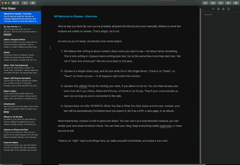
    Sleeper is a new set of Features for nodenogg.in allowing the node text that is gathered by a team to be compared with a reading list, a small set of data and provide possible ways for the team of students, researchers, and team to consider new avenues of idea generation and ideation. The idea is to allow your words as a team to;

    EXPLORE, REVEAL and EXPERIMENT with the CORPUS (reading list)

    The original version of this idea came out of my PhD and the rough draft can be read on Manifold followed by the funded application too on Manifold. The pilot funding has been provided by the Web Science Institute (WSI) to support creating the SleepeR proof of concept. I then have to look to apply for further funding when I report back on the pilot's outcome to the WSI in the summer of 2023.

    So, I have assembled a small team of interested and useful individuals, Lesia Tkacz, Ash Ravi and Maddie Dwyter, who are helping to make and test this proof of concept.

    Our roles are;

    Leads

    Adam Procter: Project Lead, this means I am responsible for the project and leading the ideas and also working directly with students/staff in nodenogg.in

    Lesia Tkacz: Product Lead, Lesia brings prior experience of Natural Language Processing (NLP) and “old school” Artificial Intelligence (AI) to the project and able to translate the ideas I have into words that the technical team can muse on.

    Technical Team

    Ash Ravi : NLP Research Engineer, Chief builder of backend python stuff. Ash is making the Sleeper features in python for us to experiment with the Corpus.

    Maddie Dwyer : Human Interface Designer, Maddie will be working with Adam to imagine and code some interface elements to bring the python terminal stuff to life inside nodenogg.in itself via extending the nodenogg.in views to include new SleepeR views and interface elements.

    The project team are using our internal Slack and not our discord for now as we are all in this tool more often daily, but the broader discussion and output will be published and made open via on thus blogs, the report document and likely some things into discord alongside my Obsidian notes on Gitlab.

    The code is also all being published openly on GNU AFFERO GENERAL PUBLIC LICENSE Version 3 as are Obsidian notes that I am taking randomly as the project progresses. This is all in a newGitlab Group.

    Part 1

    In the first week, Lesia helped to extract the selected texts we had gathered to support the games design and art TOY project into the first mini reading list as readable txt files, we could use this as our initial CORPUS. We also agreed some internal terms to help organise ourselves.

    CORPUS = texts, journals, and books from the “reading list”

    DOCUMENT = the selected text from the CORPUS

    KEYWORDS = words extracted from the JSON file from each team's microcosm nodes

    EXTRACT= span of text in the document that contains the keywords

    For our first CORPUS we brought in was these initial set of texts

    • Excerpt from Roland Barthes from Mythologies on Toys
    • Reay, E. (2022) ‘Immateriality and Immortality: Digital Toys in Videogames’, Playful Materialities
    • Giddings, Seth (2019) ‘Toying with the singularity: AI, automata and imagination in play with robots and virtual pets’, in Giovanna Mascheroni & Donell Holloway (eds) The Internet of Toys: practices, affordances and the political economy of children’s smart play. Palgrave Macmillan.
    • Heljakka, K. (2017) ‘Toy fandom, adulthood, and the ludic age: creative material culture as play’, Fandom, Second Edition: Identities and Communities in a Mediated World, edited by Jonathan Gray, Cornel Sandvoss and C. Lee Harrington, New York, USA: New York University Press, 2017, pp. 91-106.
    • Blasdel, A. (Nov. 2022), ‘They want toys to get their children in to Harvard’: have we been getting playthings all wrong?’, The Guardian, https://www.theguardian.com/lifeandstyle/2022/nov/24/have-toys-got-too-brainy-how-playthings-became-teaching-aids-young-children

    Lesia then used an existing programme called AntConc to test some ideas on how we might take keywords and do a compare with the CORPUS. The overall suggestion was to start simple and start with TF-IDF (term frequency-inverse document frequency) to compare keywords from nodenogg.in microcosms with the CORPUS.

    Part 2

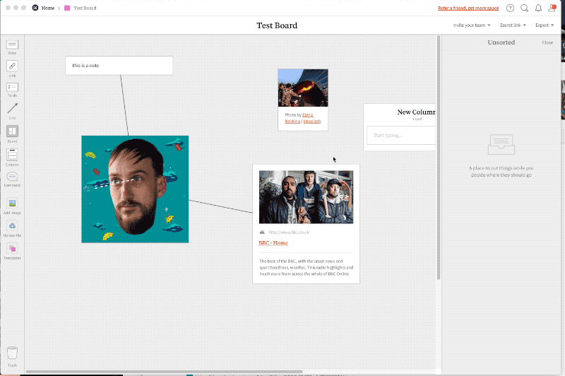
    Next, I was set to gather some real keyword data. So, in the game's studio, I explained the overall concept of nodenogg.in to year 1 Games Design & Art students and the concept around how the new SleepeR feature would recommend readings from the CORPUS. Each student was then placed into their teams after the field trip to Legoland. Each team was to work collectively on idea gathering, and would use nodenogg.in and its Collect view to gather thoughts. I ran three sessions in that one day.

    These exercises using nodenogg.in included;

    Exercise 1: create single nodes with keywords, as many keywords they could each think of per team specifically on the Legoland field trip.

    Exercise 2: write together in nodenogg.in nodes thoughts and ideas on the 5 emotions chosen for the thematic under pinning of TOY. Sadness, Joy, Anger, Fear, Expectation, Surprise, Acceptance, Disgust

    Exercise 3: use nodenogg.in to think out loud and gather general ideas and visuals related to Toys, Craft and Textiles, one member of the team had to visit the library and bring back physical items.

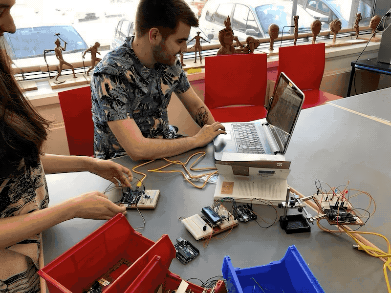
    While this was underway, Ash was making the concept as outlined already into a small Python programme. The programme would take the keywords (JSON) from exercise 1 in the studios within nodenogg.in, and use the CORPUS to do a TF-IDF lookup and provide each team with the “top” DOCUMENT they should read.

    Here are the results from each team with the 5 keywords inside their microcosms, the scoring that was applied to each word and which was the top document they should read.

    toy9.json
    `                scores`
    `storytelling  0.415010`
    `combining     0.415010`
    `land          0.207505`
    `inside        0.207505`
    `message       0.207505`
    `'guardian_article_they_want_toys_to_get_their_children_into_harvard.txt'`
    
    `toy10.json`  scores`
    `welcome    0.367053`
    `dreamer    0.367053`
    `audience   0.367053`
    `player     0.296136`
    `education  0.296136`
    `'Reay Digital Toys.txt'`
    
    toy11.json`
                 scores`
    welcome    0.311668`
    themed     0.311668`
    curiosity  0.311668`
    whimsical  0.311668`
    dreamer    0.311668`
    'Reay Digital Toys.txt'`
    
    `toy12.json`
    `           scores`
    `welcome  0.562550`
    `system   0.376746`
    `created  0.376746`
    `color    0.281275`
    `creepy   0.281275`
    `'giddings_Toying-with-the-Singularity.txt'`
    
    toy13.json`
                   scores`
    shopping     0.368065`
    welcome      0.368065`
    realworld    0.368065`
    educational  0.296953`
    holiday      0.296953`
    'guardian_article_they_want_toys_to_get_their_children_into_harvard.txt'`
    
    
    toy15.json`
    `              scores`
    `stimulation  0.369146`
    `welcome      0.369146`
    `dragon       0.297824`
    `build        0.297824`
    `lego         0.247221`
    `'giddings_Toying-with-the-Singularity.txt'`
    
    `              scores`
    `lego        0.596953`
    `shop        0.297119`
    `creativity  0.198984`
    `park        0.148560`
    `rest        0.148560`
    `'guardian_article_they_want_toys_to_get_their_children_into_harvard.txt'`
    

    After the teams had all had their top DOCUMENTS returned, we did a small survey and of all students who responded they said most had not read any of the DOCUMENTS in the CORPUS and that all were now more likely to read the “top” DOCUMENT now.

    Part 3

    Next we discussed what make this more useful, and to perhaps provide a view into the CORPUS maybe taking the “top” DOCUMENT and providing detail such as an EXTRACT.

    We also tested added to our CORPUS two more DOCUMENTS from the broader reading list. To see what impacts that may have on the data.

    • Rules of play: game design fundamentals
    • The art of game design: a book of lenses

    We didn’t have a chance to return this data response to the students, but it may also be worth the idea of using the same data from nodenogg.in against competing CORPUS sets to push and pull project ideas between, Game Theory/practice and other external concepts from 2 CORPUS banks.

    Key takeaways and next steps

    Even with the simple recommendation of one text for each team to focus on, students suggested there were more likely to read the provided material. Which proved that they didn’t read the material even though it had been provided well in advance of the project starting, and this simple action activated the readings.

    • Pull out paragraph data and present that alongside top
    → 4:46 PM, Mar 15
  • Spatial Interfaces

    Bekky bekks uHjavoy0fBs unsplashPhoto by Bekky Bekks on Unsplash

    Why are we seeing such a rise in spatial tools?

    Article incomplete…

    Main take aways

    • ITEM 1
    • ITEM 2
    → 11:53 AM, Nov 6
  • Anonymous !important

    Alora griffiths 6XUKomqujZM unsplash 1 Photo by Alora Griffiths on Unsplash

    When you assign yourself a name in nodenogg.in you are not creating a log in or are you identifying yourself this name purely establishes a local relationship between the device and your nodes. This is what enables you to add and edit your own node.

    The relationship is a between a local storage pouchdb and your assigned name also stored in local storage. Then when you join or create a microcosm you can add nodes there with this relationship intake, you can also keep the device name between microcosms

    All the data in your pouchdb is synchronised to a couchdb instance which is what enables other people to join the same microcosm and work together in real time in the same digital space. The data from each person is copied to everyones devices and the pouchdb/couchbd sync manages the changes. The data is currently not encypted but there is no way you can find out whos data belongs to who, unless you hack th couchdb and know the microcosm that was being used and the device name you provide was something identifiable.

    Ok that's a basic introduction to the technology, the name you provide is never exposed to anyone else in the interface. This is very different to popular spatial tools such as Miro and Mural.

    Screenshot 2020 11 06 at 12 05 21 Meetings and workshops

    As you can see the people involved are shown by active cursors and their names. This has two issues, the first is the screen is so busy with cursors moving it can be very distracting, and second you can also identify who is moving what and who contributed what

    In a workshop or session in which you ask a group to continue to a single space, the issue of being identified reduces participation and increases anxiety in what they contribute

    During the building of nodenogg.in we have used a number of services to co-create together, the tools that identified contributions, OneNote, Google Docs, Slack impacted on both contribution volume and also in conversation with students they were very selective in their approach to contributing, they didn't want to look silly or not as good as others.

    Yet when we ran feedback sessions using an etherpad in which students could create unidentifiable names (although exposed in the UI), the volume of participation increased and students felt freer to contribute, of course they had fun with the names and would eventually identify themselves normally. An example of this in actual system of hierarchy is is the idea of the HIPPO (Highest paid persons opinion), this can end up leading the direction of the idea generation, whether intentional or just by the fact you know they are the 'boss'.

    Article incomplete…

    Main take aways

    • Being anonymous increases engagement.
    • Being anonymous reduces anxiety.
    → 12:05 PM, Jun 19
  • 'Living on' nodenogg.in

    Peter secan kKXBw9Exn30 unsplash

    unsplash-logo Peter Secan

    As nodenogg.in progresses, I keep seeing flashes of how it would help to organise, or be used in, my own thinking practices, and so I occasionally get frustrated with the speed at which I’m able to advance its capabilities. Still, I have to remind myself that I’m not running a research lab, and that I can only devote so much time to the project in the part-time allocation I have.

    Whenever I discuss a concept or an approach to interacting with the nodenogg.in data I know its possible and could be fun yet I cant program as fast as I want, I have never professed to be a coder and whenever asked I always advise I’m not a coder I’m a hacker.[footnote]I also really like the term tinkering[/footnote]

    50% of computer programming is trial and error, the other 50% is copy and paste. - Pawan Sharma
    Testing of version 0.0.X with students has been excellent, and the next phase of 0.X.X is all about incorporating the ideas generated and feedback received from that version. So the jump in the semantic versioning as a minor update is in part due to the need to rewrite the code from scratch.

    In order to take advantage of the realisation that I could–and should–build with proper semantic HTML in mind, as well as all of the Vue.js learning I’d personally undertaken coupled with a number of excellent conversations with Toby, I felt that a complete re-write was very necessary. This has instantly started bearing a lot of good fruit, as can be seen in these progress videos:

    • 0.1.0 YouTube
    • 0.1.9 YouTube
    • 0.1.10 YouTube
    I know that the sooner I can start using nodenogg.in for my own thinking, the more the project will advance with regard to the core principles of delight, whimsy and serendipity.

    Of course, the goal is to test this within the design studio thinking process as soon as possible, although the COVID-19 lockdown will negate that to some degree for a while!

    Thinking about testing, I was reminded of Ken Kocienda’s book Creative Selection. He was an engineer at Apple who worked on creating Safari for macOS and the touch keyboard for what would become the iPhone (the ‘Purple’ project). It was a revolutionary piece of touch design that could, if gone awry, derail the whole project, as the Apple Newton’s hand recognition software had. When describing working on ‘Purple’, Kocienda mentioned the idea of ‘living on’: the day-to-day routine of using in-progress software as if it were a real product.[footnote]Other technology organisations have tended to use the terrible term ‘dogfooding’ for this concept. [/footnote]

    So, as part of our new weekly chats, Toby and I have set aside some drivers to get us ‘living on’ nodenogg.in as soon as possible, which I hope will eventually lead to more people testing the alpha release. Regarding how we’re “living on”, I’m trying to keep the list of drivers as short as possible, as the intent is to release often and iterate. We don’t want to fail quickly, but this is a human-centred design process and thus the more humans involved, the better.

    Keep an eye on the main site for the latest alpha alpha build, and please do give any thoughts or feedback any thoughts via the discourse below.

    Main take aways

    • 'living on' nodenogg.in asap is going to key to pushing forward delightful design choices.
    • Note that trusting software is also important, this needs to be considered.
    • Will people put data into an alpha app (see point 2)
    → 3:25 PM, Apr 17
  • Emoji Reactions

    Bernard hermant bSpqe48INMg unsplash

    unsplash-logo Bernard Hermant

    ✌️Who doesn’t love emoji ❤️?

    These funky Unicode characters were all but unknown until the last decade but long before European embraced the Japanese Emoji. Many of us used a serious a keyboard characters to add emotion to our text messages this was my preferred smile was a semi colon followed the right parentheses :) (which is now auto converted on most systems to the emoji icon) but many used the longer version to include a nose :-). Pictograms have a long history themselves and this blog post would be amiss if I didn’t include some of the work of Otl Aicher.

    Otl Aicher was a german Graphic Designer and co-founder of the Ulm Design School. His work on designing the 1972 summer Olympic design language via pictograms for representation and signage has gone on the influence design across the world. These pictograms provide short hand visual representations of more complex information.[footnote]I talk more about Data Visualisation in a previous article[/footnote]

    Pictograms provide a shorthand and emojis add in the elements of emotion, play and delight. The history of emoji is embedded in digital technology

    We now see emoji reactions being added to numerous platforms as a button to encourage the use of them as a response, some of this is in response to the Like button being initially universally annoying when someone posted of a tragic situation and you did know what to say all you could do to show support was to like the post. So gradually services like Facebook added more options.

    In previous testing using etherpad we would use emoji to up vote ideas and comments on presentations.

    IMAGE

    Article incomplete…

    Main take aways

    • ITEM 1
    • ITEM 2
    → 12:00 PM, Apr 7
  • Why PouchDB and CouchDB?

    Inside weather ej3UoXYMaRI unsplash

    Inside Weather

    Once I was alerted to the fact that CouchDB existed I was really pleased with how it would fit into the tech stack. Firstly it is Apache Licensed.

    It is web tech focussed with a focus on local data and although you can run it on a server, they also have a desktop application which means you can run the whole set up with local connections only, this connects to design principles of data ownership.

    A group of makers / designers can just “spin up” and instance of nodenogg.in and there is no need for a centralised source of the data, it is stored on all machines with one of the devices managing sync. The data structure is JSON which is a great structure and also human readable, along with being able to almost mirror Vue data structures.

    I installed CouchDB on a centOS box very easily, the other thing that was great was the document model over tables structure model for the data meaning that you can in fact build the schema as you go, this meant that my first few attempts at data structure wouldn’t cause headaches as this could also iterate over time.

    PouchDB is a javascript implementation to connect to a CouchDB and the structure mirrors CouchDB. I was also able to quickly use the docs to get a Vue application talking to CouchDB.

    The main issue for me was simply understanding where and how to import the library within Vue, there was a bit of time spent on Stack overflow and googling the ways to import libraries, I had some experience with this previously in my other Vue experiments but having also moved to use Vue cli via Vue ui this was much easier to do with the web interface to find and add to project.

    I made a little video about the basic set up of my Vue projects at YouTube.

    PouchDB is an open-source JavaScript database inspired by Apache CouchDB that is designed to run well within the browser.
    PouchDB was created to help web developers build applications that work as well offline as they do online.
    It enables applications to store data locally while offline, then synchronise it with CouchDB and compatible servers when the application is back online, keeping the user's data in sync no matter where they next login.

    Main take aways

      → 12:00 PM, Jan 10
    • Mini Browsers

      Edu grande 0vY082Un2pk unsplash

      unsplash-logo Edu Grande

      Mini Browsers are everywhere. This 24ways article goes into much more detail on what they are and how to create them so I wont cover that ground.

      Article incomplete

      Main take aways

      • Providing web app expriences that delight involves a lot.
      • I think there is a need for an updated html boilerplate.
      → 12:00 PM, Jan 9
    • Keyboard shortcuts

      Juan gomez kt wA0GDFq8 unsplash

      unsplash-logo Juan Gomez

      I knew keyboard shortcuts would always be a really important feature for nodenogg.in, I am a big fan of keyboard shortcuts, maybe that’s due to my macOS usage which always seemed to have a good focus on shortcuts and productivity, much more than Windows ever did. For me the main issue to consider with getting ideas out of your head and into any system is reducing cognitive loads.[footnote]TO REVIEW: Kalyuga, S. (2015) Instructional guidance: A cognitive load perspective. Charlotte, NC: IAP Information Age Publishing. Available at: search.ebscohost.com/login.asp… (Accessed: 25 December 2019).[/footnote].

      Let’s take the post it note as the often default starting point for a design thinking process and as it becomes clearer to me that nodenogg.in is a co-creation[footnote]

      designers and developers will need to learn to co-create cooperatively. This is not the same as collaboration, where small or large teams work on a certain product or outcome. Cooperative work involves multiple individuals and groups working within a common environment or infrastructure, and helping support that network or infrastructure for mutual benefit, while working on different objectives or outcomes.
      Downes, S. (2019). A look at the future of open educational resources. International Journal of Open Educational Resources, Vol. (2).[www.ijoer.org/a-look-at...](https://www.ijoer.org/a-look-at-the-future-of-open-educational-resources/)[/footnote] tool, this mode of quick input followed by then arranging, its becomes more evident the starting mode of rapid entry will benefit from shortcuts the most.[footnote]A new bucket mode joins the spatial mode as shown in version 0.0.27d, still to be tested and tweaked.[/footnote]

      Some steps of process - post its

      • Get the system out of the way, Great ideas really fly when in 'flow' state. Post it notes are a good example to follow.
      • The barrier to use is as low as possible.
        • Post its have an inbuilt character limit[footnote]Depending on your hand writing size[/footnote]
        • They start as a collection tool.
        • And then can become a spatial tool.
      Keyboard shortcuts would help address this process. However picking the right ones is not as easy as it seems.

      The process is never that linear when making something like nodenogg.in I am just chipping away at little bits of core functionality and I initially saw the needful keyboard shortcuts to allow quick connection and connection delete mode.

      I was mainly thinking about the fact that after one connection was made this mode was turned off, so this would allow 2 handed control of the spatial view using the keyboard and mouse together to rapidly connect nodes and it would help me learn the necessary code for implementing keyboard shortcuts in Vue and Javascript. It was after this that the idea for quick creation would help with the cognitive load concerns I had when testing the initial input mode where students would open one node and just type only into this, the act of finishing and creating via buttons was way to slow and distracting.

      So a purely practical starting point, I decided a good rule of thumb would be to follow the path a person is already familiar with so this would be to use well known shortcuts. On macOS these use the Cmd key followed by a letter so for example Cmd + n would mean new and this is what all macOS apps follow as convention, however to create these and it turns out that the Cmd key is apparently not considered a modifier key or at least it seems now that it is the Meta key which maps to cmd (macOS) and the windows key (Windows). But as nodenogg.in runs in a browser, I would need to disable any default behaviour of the shortcuts, this would be wrong, taking over these commands just because a person is at that specific URL would not be delightful.

      So I proceeded to map to the Ctrl Key, I thought initially that I would use the keys c and v although usually used for Copy and Paste I felt that it might map to faster human interactions, this worked well initially in terms of muscle memory, aka my hands where often use to these two commands. A bug then appearing at this stage where I would end up editing the previous data entry, it took me a while to realise what was causing this, I had set the editor text entry to get focus on opening so you could start typing straight away however now the keyboard shortcut was so fast that the editor “heard” the shortcut and started editing the previous entry as the new entry was not yet ready, clicking the button and typing was fine but the shortcut messed this up, so what I did was add a slight delay on the focus so the system was ready for input at the right time, it was a nice distraction and fun hack to deploy.

      Of course I went to test on Windows and stupidly realised that the default key for Windows is Ctrl and so on windows these shortcuts would be conflicting. I next decided to move to the Shift key, why I did this before option or alt I am not sure now. I also decided to stick to c and v and that people would grow accustomed to this and then added z and x as Create and Close, next to c and v as Connections and Delete Connections. Of course I hadn’t considered what would happen when you typed a Capital in the note editor panel, so we did a bit of testing with the rule to not use capitals, if you did use a capital the system would try to perform said shortcuts which would usually close the editor. I also tried a new approach as I wanted to have a universal approach with a modifier key and swapped to Ctrl + 1 /2/3/4 again not considering on Windows this switches tabs in a browser. I then moved to the Option or Alt key. Adding Option plus and minus to zoom in was rather satisfying as it helped resolved the boundaries issue where you could drag something off the edge and quickly added the infinite canvas function I wanted, small win which I hadn’t even considered, this involved a little SVG canvas research.

      keycode.info

      I might revisit META + Enter to close the window however I would need to work out how to target windows with another shortcut and this would mean moving between OS would have different actions where as in fact sticking to a universal action Option + Return could make this more useful not only for the people using nodenogg.in but also in explaining how to use nodenogg.in

      Main take aways

      • Sometimes things you think are simple take time.
      • Keep up on the blog (more than you think) !
      • Try and keep notes on even small changes as recalling exact details was hard
      • Git versioning in gitlab can show progress (obviously) maybe something to visualise for PhD write up too.
      → 9:38 AM, Jan 9
    • Microcast - Thought Shrapnel

      Austin distel VCFxt2yT1eQ unsplash unsplash-logo Austin Distel

      This morning I was fortunate for Doug Belshaw to give me some time on his microcast thought shrapnel to discuss and talk about the latest iteration of nodenogg.in and the practice based PhD it sits within. Please do take a listen and of course feedback welcome.

      Main take aways

      • Always good to explain what you are doing.
      • Want to do more podcasts talking about project in 2020
      • Found some more bugs
      → 2:06 PM, Jan 8
    • Collaboration versus Co-creation

      Kaleidico 26MJGnCM0Wc unsplash

      unsplash-logo Kaleidico

      There are plenty of tools that are designed for collaboration and remote work. However this is not the same as co-creation.

      designers and developers will need to learn to co-create cooperatively. This is not the same as collaboration, where small or large teams work on a certain product or outcome. Cooperative work involves multiple individuals and groups working within a common environment or infrastructure, and helping support that network or infrastructure for mutual benefit, while working on different objectives or outcomes.
      • Downes, S. (2019). A look at the future of open educational resources. International Journal of Open Educational Resources, Vol. (2).[www.ijoer.org/a-look-at...](https://www.ijoer.org/a-look-at-the-future-of-open-educational-resources/)
      Article incomplete

      Main take aways

      • Item1
      • Item2
      → 12:00 PM, Dec 19
    • Networked Making

      Marvin meyer SYTO3xs06fU unsplash unsplash-logo Marvin Meyer

      nodenogg.in allows you to create and edit notes and attachments with a group of designers / makers in a shared digital space, these notes and attachments can be placed visually in a spatial arrangement and connections draw between them to provide cluster and connected relevance to a problem or research theme you are trying to investigate.

      Web 1920  3 2x

      nodenogg.in is not an online collaborative tool but is being designed to augment the physical design studio and should be used together allowing you to capture collectively the teams thought and research process. The tool is design to support co-creation of resources and thoughts using a design thinking approach. The main initial application is to support project based learning, within a design school enviroment.

      IMG 9284

      All notes and attachments sync to all devices, so once the design session is completed all parties have local copies of the distributed data.

      youtu.be/Y1k_F0g6j…

      nodenogg.in was created with design education in mind. If you would like to get involved is using and even contributing visit https://discourse.adamprocter.co.uk to join the discussions and find out more.

      → 5:55 PM, Dec 17
    • DEWG Testing - 5th Dec

      Kelly sikkema 1 RZL8BGBM unsplash

      unsplash-logo Photo by Kelly Sikkema

      I am fortunate to be a member of the Digital Education Working Group (DEWG) at the University of Southampton, although I wont go into too much detail, its worth sketching out the group a little, we are hoping to become a committee one day.

      The group comprises of individuals from across the University in Academic, Research and Professional service roles who have a keen interest and background in technology and learning. I tend to be there to lean on the Humanities side and get us to think about the people using the technology and how we leverage and delight the people in our organisation to better deliver world class education. We as a group try (very hard) not to get sidelined by what technology we should use or deploy but consider the overarching aims of empowerment through technology and how to better support our staff and ultimately our students as they enter a constantly networked and digitally connected world, no matter their core discipline of study. So I tend to be talking about digital literacies and the pitfalls of navigating our information society.

      We meet once a month and initially our work has been quiet reactionary, with thoughts and reflections on the roll out of services like Office 365 and one larger piece of work was providing recommendations to the University Education Committee on what they must be doing to meet the new web accessibility laws as they come into effect for public organisations within the UK.

      However our main task has been to discuss and create a vision for Digital Education at the University of Southampton which would connect to and inform the Universities Education Strategy, we have debated a lot about the word digital as we think everything is digital and this type of thinking should just be inside the Education Strategy however that is something that may take a while to change. For now we need a vision and some factors around what makes a great educator at the University of Southampton.

      So at the last meeting after an update on some of the accessibility work being carried out internally to make our Blackboard Inc. installation more inclusive we where tasked to use either post it notes or a Padlet in groups of 3 to revisit the vision and connected topic, our group was assigned the topic educator.

      It dawned on me why use Padlet when we could use nodenogg.in instead, this would also test my theory around being able to “spin up” an instance easily and to instantly work on an idea in a group. I managed to persuade the group quickly to not use Padlet and test nodenogg.in. Within less than a minute we where all hooked up to a new instance, by following my simple guidance. We started working on co-creating some thoughts on the task at hand. The only blip was Microsoft Edge on a Dell XPS (with touch screen) seemed to have some issues creating or joining an instance, but quickly switching to Chrome seemed to resolve this. Also the Dell machine seemed to have issues with the double clicking to edit as well, which didn’t really matter for the task at hand but was odd. The other member of the group seemed to instantly understand how to use nodenogg.in and very little guidance was needed. I also later made a special direct link to this instance and shared it with the whole digital education working group. We shall see whether anyone else adds to or creates more connections remotely. One of the questions was why use that when we have a Padlet, my initial answer was because nodenogg.in is Free Open Source Software (FOSS), which quickly resolved the argument.

      As an aside I noting afterwards Padlet’s privacy policy which we would be agreeing to just by using it. Here is a quick peak at some high level points it makes, some designed to improve the service but most ultimately connected to adverts. [footnote]

      • track behaviour on Padlet
      • show third-party ads
      • we collect your IP address
      • we may also obtain information, including personal information, from third-party sources
      • collect device-specific information such as:
      • device brand, version, and type
      • operating system and version
      • browser type and version
      • screen size and resolution
      • battery and signal strength
      • show ads about Padlet outside of the Service (e.g. on LinkedIn)

      [/footnote]

      So by choosing nodenogg.in we kept all the data to ourselves and this was all stored locally on the laptops in the room, this got some approved nodding in the group and we didn’t inadvertently share any of our device details, IP address or provide data for 3rd party advertisers. A small win for nodenogg.in I would say.

      Screenshot 2019 12 06 at 18 37 34

      Main take aways

      • Being able to quick create a shared (private) digital space was as easy asa I hoped
      • Shared digital space inclusive by design, you didnt need an account or must use 'twitter'
      • Very little explanation was needed, can I / do I need to make thiz zero
      • Edge browser needs checking
      • Edit mode needs checking
      → 3:38 PM, Dec 7
    • Current Tech Stack - Nov 2019

      Holly stratton jN1C3 edaro unsplash

      unsplash-logo Photo from Eaters Collective

      I have recently found myself sharing again a link from Nov 2017 about some of the prototypes back then, so it become apparent I need to provide an update on the tech stack being used now within my project, without the need to dive into the code itself.

      The stack is now Vue.js with Vuex connected to CouchDB via PouchDB. The resulting information is rendered in html using a number of components and standard SVG elements to create interactive views. The use of additional plug ins has been removed unless necessary, this helps keep the project inline with the GNU Licence.

      The biggest change is to move to CouchDB and PouchDB this has replaced my previous use of deepstreamHub which initially looked like a great open source alternative to Google’s Firebase however the deepstreamHub which was a cloud instance of deepstream stopped working and hasn’t been updated in a long time. I made a number of attempts to run my own deepstream, which was one of the reasons for picking the platform, the open source server tech, but trying to get this running in the same way the hub version worked proved to be fruitless.

      It become very apparent this was a major block in the project. I reached out to a developer friend of mine to see what else he could also locate out there, we chatted over the general project aims, realtime nature, the vue.js json style structure and had been useful within firebase, we also discussed the ownership of the data so he went off to think about what could provide the underpinning structure I wanted.

      He came back with the suggestion of CouchDB and subsequently PouchDB which would also answer my need for local storage and offline capabilities. After making the changes to the project to use PouchDB and CouchDB I also was pointed towards an interesting article from ink and switch looking at the development of local first software and the concept of owning your data, in spite of the cloud, which chimed very much with my research [footnote]They have very recently released PUSHPIN which is a collaborative spatial interface tool.[/footnote] and although they seemed to rule out CouchDB, due to some concerns over conflict resolution and its ability to do realtime, I have not hit those kinds of issue and have realtime collaborative capabilities working.

      A little gif showcasing nodenogg.in’s use of realtime collaboration.

      Realtime couch

      Main take aways

      → 6:11 PM, Dec 2
    • Testing - 29th Nov 2019

      David pennington T GjUWPW oI unsplash

      unsplash-logo David Pennington

      This testing session was carried out with year 3 Games Design & Art. This test was using nodenogg.in version 0.0.24d (YouTube explainer). The students were presenting a series of potential game ideas to each other, some of them in teams. The format for each was a 12 minute presentation of their 3 game ideas with accompanying slidedeck. The other students used a nodenogg.in instance to comment as the presentation was happening and afterwards for a few brief moments. The one main question I posed to each team to outline that could be answered collectivly via nodenogg.in was what is there biggest struggle issue? For example choosing which game idea to go forward or another aspect that the “crowd” could help on. In reflection from this session I think a more focussed use of nodenogg.in on the question at the end could have worked better as I noticed that contributing live specifically with the spatial view only on show was much harder, the cognative load was high, to listen type and see spatially. This was in part to removing the list view, this again gives rise to the idea of a series of views that work better for different types of sessions for using nodenogg.in. Although some of the connections and such started to be draw as seen in this screenshot, even with the shortcuts, the crowd couldn’t think that fast.

      Wip nodenog

      Also I felt much more this time as I was involved in thiking and responding during this session as well I think I miss some of the issues students hit with nodenogg.in. In future I need to either be recording the session in a way that is useful for my own reflection or get another staff member to use the tool in a perscibed way with students while I just observe the use. We have a big session set for the end of January which I need to prepare the use case / cases so I can gain the most useful feedback from this as much as possible. This will likely include blocking in some time to get students to write feedback into discourse. May need to use Microsoft Forms as discourse is public and students need to join to complete, which is a barrier for sure

      This testing has shown that the spatial view is a slower thinking space, which needs to be coupled with a quicker throw thoughts into a bin exercise.

      For this work we first need a bucket collect mode. Then we move into a spatial view where these are first neatly arranged[footnote]Some type of initial auto placement. based on entry time perhaps?[/footnote] and then facilitate a spatial process on the ideas, discarding some, clustering some, connecting some and making new informed and more details inputs into the spatial view.

      The spatial view does needs to trim up the text, but there has to still be the ability to glance at the information and arrange as having to keep opening a reader view may be too slow even in the spatial mode.

      For now I’ll call these two actions modes, Bucket mode and Consideration mode.

      Main take aways

      • Bucket mode to be turned on.
      • Reader view needs some work.
      • Gathering more feedback in sessions is really important.
      → 7:11 PM, Nov 29
    • No log ins please!

      Gary bendig XWRC2hjx 1A unsplash unsplash-logo Photo by Gary Bendig

      I was keen to eliminate the need for any type of log in, as storing usernames and passwords would be problematic, this is due in part to one of the privacy design principles for nodenogg.in in that the system must only store data it needs to know and then any said data should be encrypted and decrypted to the owner of that contribution. Also this would require the process of signing up, which would drastically slow down the ability to just point a group of designers/makers to a URL and start working together, this would also rub up against one of the other principles of delightful design, signing up and saving passwords even with 1Password is not really delightful.

      nodenogg.in does however need a way to identify contributions and so it uses the value attached to the device name (client id), this is decided by the contributor when they arrive at the initial URL for the first time, this is then used as the name of each document[footnote]CouchDB’s data structure uses documents instead of tables and is formatted as Javascript Object Notation (JSON) which also easily matches vue.js’s data structure.[/footnote]. When you decide on a device name this creates the new document which is the data structure for contributions. Clustering contributions into documents to a device enables differences in read / write access to said data and enables the contributor to easily remove, export and single out their own contributions. Other data such as positions and connections are stored as separate documents to simplify the way to create and manage shared views.

      Screenshot 2019 11 13 at 22 04 40 Screenshot 2019 11 13 at 22 05 02

      I had specifically been looking at the process that was used within micro.blog and I had used to some degree before back in my PHP coding days, that of using a URL with a token appended, this URL is then emailed to you example.com. This would negate the need to store usernames or passwords but would require a way to email said URLs from the server, which I was not keen on, although Sendy[footnote]Sendy is a self hosted email newsletter application that lets you send emails via Amazon Simple Email Service (SES).[/footnote] could have possibly done this and has many options to not track, however this felt overly complicated for what I required.

      IMG 0322B3E11A3A 1

      During some of this researching I was reading around using Javascript Object Notation (JSON) Web Tokens (JWT), which led me to web storage. I soon realised that I could use web storage to store the device name within localStorage [footnote]localStorage is a persistent storage kept in browsers until the user chooses to remove it[/footnote] so that after the initial ‘log in’ vue.js could check on any arrival if this storage was in place and redirect the visitor straight to making contributions on said instance, thus “logging” them in.

      When you first visit the URL you are requested to input a “device name” this is then stored on your browsers local storage and enables you to “log in” without the need for a username and password. When you next load the page this token is looked for and if found connects you to the correct document store. Deleting the local storage would require that you enter a device name again, however specifying the same device name would basically connect you to the same document store.

      Screenshot 2019 11 20 at 19 35 14 This approach worked really well in the end. In testing students could all quickly grasp the idea of naming their device and would quickly assume pseudo names. I would like some feedback on changing the wording of "device name" to something the seems to be less technical as this could be a bit of a barrier to the intuitive nature of getting up and running, I think it causes a huh moment, a pause and thus a break in user [footnote]I really dont like using the term user but just replacing it with human is odd, I might start using designer/maker [/footnote] flow as each time we have tested I have always said "put in a device name it can be anything you want it to be."
      → 7:37 PM, Nov 20
    • Milestones

      Thomas galler hZ3uF1 z2Qc unsplash

      unsplash-logo Photo by Thomas Galler

      I plan to post more updates to researchnot.es going forward with some more details on the project milestones as we ramp towards the end game, the schedule and thoughts. Although I highly recommend following my micro.blog discursive and specifically the PhD category, you could use NetNewsWire to do this as I document ongoing thoughts and things related to this project in much more casual and regular basis. Here the posts will be milestone documentation. The Official research documents will be on manifold.soton.ac.uk. All feedback welcome at discourse, each post here will have a specific option to pull in comments as well. Also I started using MarsEdit to post to the blog so that should make things much easier.

      → 10:11 AM, Nov 13
    • Year 1 Testing - 4th Nov 2019

      Charles YJxAy2p ZJ4 unsplash unsplash-logo Charles

      After using nodenogg.in with the final year students a number of times with a reasonable success. I realised that the session I had planned with our first year students was a week before their very first presentations and that it could be another way to test my hypotheses from the very first test that nodenogg.in could be used to calm the nerves of students as deadlines approach. By making the students anonymously come to the realisation that everyone felt very similar and had the same types of concerns. For this session I also removed the list view from within nodenogg.in and presented just the spatial view on its own, and removed the ability to see device names increasing the level of anonymous interactions.

      We posed a question to respond to inside nodenogg.in. What are you worried or concerned about for Friday’s Presentation? As the students started to add comments you could feel the tension lowering in the room as it dawned on them that they all had similar issues, the fact it was anonymous was also again popular. One student also without prompting started to organise and cluster the nodes together spatially as similar thoughts appeared, this may have been prompted by me suggesting this, I am not sure, however interestingly as one student had taken the lead on this task and others didn’t mess around with this student being the designated organiser, although we didn’t know who it was until I was walking around the room looking at students use the platform. I tried to elicit feedback afterwards on discourse but that didn’t work! I will allow time for this feedback to be gathered in the future.

      Again I had my mac plugged into the main screen projecting the activity in nodenogg.in, which reminded me of a view mode toggle that would be good as a present mode.

      Screenshot 2020 01 06 at 14 05 56 As staff we then talked through the concerns on screen and this made the session really useful for collective reflection and pause with an impending deadline.

      Main take aways

      • Clearly working to help support end of project concerns, realising your not the only one.
      • I was able to help by talking about the collective concerns.
      • Could you have an option lock down spatial arranging to one person.
      • The concept of big screen viewing mode would help.
      • Reflective use prior to deadline.
      • Allocate time for discourse feedback (make students do it).
      → 3:48 PM, Nov 4
    • 1 Theme Testing - 1st Nov 2019

      Rene bohmer YeUVDKZWSZ4 unsplash unsplash-logo Rene Böhmer

      This test was where I introduced the spatial mode and the list mode together for the first time. Students also started to use the different types of nodes including the link node and attachment node. However viewing the attachments and linking out was not possible.

      Screenshot 2019 10 26 at 11 08 28

      Students started automatically moving around the objects in the spatial view, which was good to see, this seemed to be more on ability to view them rather then to order them to start, I also think the number of students contributing dropped. I think the main reasons that links and attachments where added this time versus the last was there was a view of the types now, in the spatial view but also I specifically asked for students to think of links and attachments and pointed out how to edit the Create type and that they could use Add to add(upload) files and images from there own devices.

      Screenshot 2019 12 19 at 15 52 39

      Screenshot 2019 12 19 at 15 53 06

      Main take aways

      • Need quicker way to detect and add links
      • Attachments could do with drag and drop
      • If link pasted in is to image it should somehow upload as an attachment
      → 3:48 PM, Nov 1
    • Connections Test - 23rd Oct 2019

      Clint adair BW0vK FA3eg unsplash unsplash-logo Photo by Clint Adair

      Even with the simplest additions to nodenogg.in testing with people is crucial, I know this is obvious but with a tool that has multiuser capabilities testing on your own is impossible, which means you cant fall to often into the trap of assuming things will be used in a specific way. After the previous testing I wanted to get the ability to make connections up and running as fast as possible in nodenogg.in. So I focused on adding this ability. I then added a number of buttons and keyboard shortcuts to also speed up the process of moving in-between interactions, create, finish, connect and zooming. I took the updated version to a team of 4 to see how create nodes and create connections I could see that they did some unexpected things. Firstly I had mapped the controls to CTRL but these conflicted with the browsers default, I had been using macOS, 3 of them had Windows. So I quickly changed that to Shift, which of course introduced an issue with Capital letters triggering the shortcut by mistake, also CMD is not considered a modifier key so I couldn’t have macOS style shortcuts. I am not sure on the best way to solve this yet.

      Screenshot 2019 12 03 at 14 45 00

      Once I had the shortcuts working what I was not expecting was when a person went into connection mode they might then start dragging nodes around again, I was expecting them to be just interested in connecting nodes. This was easily fixed by turning off connection mode if someone started dragging icons.

      Main take aways

      • Popping into the studio to quickly test a small function is very useful
      • Providing specific tasks can help direct testing
      • Need to do more ad-hoc testing
      → 1:47 PM, Oct 23
    • 3 Themes Present - 18th Oct Testing

      Nathan dumlao ewGMqs2tmJI unsplash

      unsplash-logo Photo by Nathan Dumlao

      The next test of nodenogg.in was with the returning Year 3 Games Design & Art students we had a slighly updated version of nodenogg.in however I disabled the spatial view as this had connection and arrangement issues and so I just displayed the shared text list view. In this first test of the new academic year I replaced my previous use of an etherpad with nodenogg.in which is also why I was happy with testing just the list text view.

      Students where presenting three themes they had been researching in a 8minute presentation while all the other students where encouraged to connect to nodenogg.in and respond live with text commentary to the presentation. Students had to select one theme to take forward and deep dive into. So other students were also encouraged to vote.

      Students appreciated this approach as they tried to help each other with ideas to follow up the theme and which theme to select. We could have just as easily used etherpad or word online, but these don’t offer the simple anonymous approach and wouldn’t test nodenogg.in to see what works and what was still causing usability issues. In this version after each presentation I had to copy and paste the responses into a text document as the system only had the capability to connect to a hardcoded instance.

      Main take aways

      • unlike etherpad students couldn't all write together as list view showed each student as a block
      • students didn't like to create more that one thing they just typed
      • no styling or use of line breaks which was not good
      • there was not easy was to vote against current text again due list view being blocks
      • spatial view and connections may resolve the above
      → 11:57 AM, Oct 20
    • Keeping a record

      Travis yewell F B7kWlkxDQ unsplash unsplash-logo Photo by Travis Yewell

      After reviewing some of my explanation videos I realised that I needed to keep a more accurate record of what where the updates to nodenogg.in and when they actually occurred. This would help mr to use the clips as reference material to any testing that takes place, so I can see which version was used within testing but also it would enable me ton look back at the project and review and record why changes had been made. My previous Youtube Video’s had been a little haphazard in this regard and I needed a more logical system.

      I was listening to Accidental tech podcast and they mentioned the semantic versioning system to better describe updates, so I applied this to my versioning system. I also found some of the built in features within Open Broadcast Studio to stamp on screen the date and time. I am still using the same process to stream the recording live to Twitch and afterwards download the video to be upload to my YouTube channel, there is a seven day window to download from Twitch, which I do need to be aware of. Brent Simmons developer of NetNewsWire whose contribution notes I have taken great inspiration from also mentioned adding a letter to the build to signify its state of play as well, so all versions currently end with the letter d for development. For now the alpha build however is also a mirror of the dev build.

      These small changes I hope will help provide a usable level of the documentation of the thoughts and ideas from each version and I expect the explainer videos to get shorter as I just cover updates and why those choices have been made.

      URLs

      • development is at [dev.nodenogg.in](https://dev.nodenogg.in)
      • alpha is at [alpha.nodenogg.in](https://alpha.nodenogg.in)
      • beta is at [beta.nodenogg.in](https://beta.nodenogg.in)
      • release will be at [nodenogg.in](https://nodenogg.in)

      Main take aways

      • Need to automate build process to each URL asap
      • Need to work on safe guarding data in beta and alpha
      • Being organised is important !
      • Need to be consistent (as much as possible)
      → 1:40 PM, Sep 3
    • Student Testing - 4th June 2019

      Science in hd lW9W3rQ cEI unsplash

      unsplash-logo Science in HD

      In June nodenogg.in was first tested within a design studio setting specifically with a group of final year BA (Hons) Games Design & Art students. The basic parts of the system where in place with the realtime sync between Vuex, PouchDB and CouchDB working as I had planned.

      The main workflow is to enter an instance, there was a pre-made instance[footnote]instance is the term used to denote independence, so groups can work on their own instance of data within nodenogg.in[/footnote] for this testing session. To join and contribute to this instance the students had to specify a device name, this can be any name you like, students used this as a chance to create fun names and to some degree instantly make their contributions anonymous.

      Screenshot 2019 11 13 at 22 04 40

      In previous work using Etherpad[footnote]Etherpad is an open source, web-based collaborative real-time editor, allowing authors to simultaneously edit a text document, and see all of the participants' edits in real-time, with the ability to display each author’s text in their own color.[/footnote]to do a simular process, I had found students really liked the ability to contribute with pseudo-names, they felt freer to comment and less conscious on being ‘judged’ on their contributions.

      So students visited the alpha URL, typed in a “device name” and where asked to basically comment on concerns they had around there the final week. At this stage the only view of the realtime data was a single column text view updating as people typed. Most students didn’t create new notes for each idea they created longer notes and made there own bullet lists or spacing, which was interesting to see, there was no formatting options avalible to them either.

      Screenshot from Nodenogg.in testing session

      I had my Macbook plugged into the presentation screen as well. Students looked at there device for typing and tended to refer to my screen to see all the data appearing live. This suggests a present view could be really useful.

      As students saw people typing up concerns the pace of contributions speed up as everyone become more confident, there was also moments of realisation as students released everyone in the room, teams or not had the same types of concerns and the feedback was this made them feel much more confident heading towards hand in and less “bad” about where they where at with the project. I was able to unpack some of the comments with the group aswell.

      Main takeaways

      • Realtime was appreciated
      • Big Screen view mode could be added
      • Anonymous input
      • Supported cohort concerns (made students feel better)
      → 6:12 PM, Jun 6
    • The mis-application of learning technologies within the context of Design Studio-led education

      This document is also on my Manifold instance here

      Research Problem

      Despite the widespread application of digital technologies in higher education there is scant evidence to suggest that these have had a significant impact on student learning. (Bainbridge, 2014, p1)
      Educational institutions spend a significant proportion of their budget on learning technologies each year. However, the underlying metaphor on which this technology is based continues to be the filing system.

      These technologies often have sharing features added as a ‘bolt-on’ to core functionality, rather than being built for project-based learning. They are designed to be separate from, rather than integrated within, learning spaces.

      Sharing is probably the most basic characteristic of education: education is sharing knowledge, insights and information with others, upon which new knowledge, skills, ideas and understanding can be built. (Open Education Consortium, [www.oeconsortium.org/about-oec...](https://www.oeconsortium.org/about-oec/))
      Some thinkers on learning technologies (Watters, 2014:22) talk of the Learning Management System (‘LMS’) as being a piece of administrative software which “purports to address questions about teaching and learning but often circumscribes pedagogical possibilities”. As Downes (2007) notes, the LMS can over-structure the learning experience, conflicting with research and evidence about how students learn.

      Design education is, in particular, a very visual field with a requirement for spatial manipulation. Current learning technologies on offer do not augment the physical studio experience, and push educators and students towards commercial, more generic offerings without a pedagogical underpinning.

      Students are used to a more ‘delightful’ experience with this kind of software, as evidenced by the quotations below:

      Slack is useful for quick & easy non-distractive communication. It is simple to navigate and provides a direct platform in which to contact peers and lecturers, creating channels and direct messaging groups is ideal for a more tactile approach to a discussion. (link)
      Onenote is great as everyone can have their own section to put their own information/images on it when working together.
      Etherpad definitely proved helpful as everyone put down questions, films, books and other information that has now given me more starting points to research.

      Research Proposition

      Project-based learning involves collaboration in physical spaces that often cannot be replicated in digital spaces. Through the creation of a spatial interface, engagement with materials and other learners becomes more dynamic and fluid.

      There is a dichotomy between tools that are personally owned and single-user by default, and Learning Management Systems provided by educational institutions. The latter offer top-down static file repository functionality and fixed courses, rather than features that support project-based learning.

      As a result, this research will begin by examining the fundamental concepts of spatial design, including mind-mapping and concept mapping. It will consider the influence of the design paradigms provided by Xerox’s PARC institute and investigate the legacy of Human-Computer Interaction (HCI) pioneers such as JCR Linklider, Ivan Sutherland, Ted Nelson, Douglas Englebert, Seymour Papert and Alan Kay.

      Some information must be presented simultaneously to all the men, preferably on a common grid, to coordinate their actions.” (Licklider, 1960, p9)
      Figure 1: Example Sketch of a spatial interface for learning objects
      A spatial interface allows users to take advantage of their visual memory and pattern recognition.” (Shippman F M, Marshall C, 1999)
      A number of education theories have been looked at and Connectivism (Siemens, 2004) will be specifically used in consideration around the tool itself

      Research Question

      Can the spatial elements of a Design Studio be replicated in a digital learning environment to enhance deep engagement and collaboration?

      Scope

      The project will create an interface which will be tested with a group of students over a five week project that will run twice in 2020 and 2021. The tool and the project will be evaluated by measuring the staff and student experience through observation, surveys and outputs.

      The entire project process will be captured as it progresses in an open and free software approach and documented at the locations below. The systematic packaging of this process and the application of Design thinking and human centered design will also reveal tool building processes and culminate in a manifesto to design these types of new design led digital tools for enhancing project-based design education.

      Current output locations

      • BLOG https://researchnot.es
      • CODE https://gitlab.adamprocter.co.uk/adamprocter/nodenoggin
      • Microcast https://fragmentum.adamprocter.co.uk
      • DISCUSSIONS - https://discourse.adamprocter.co.uk
      • FORMAL WRITINGS - https://manifold.soton.ac.uk
      • FOLLOW - https://discursive.adamprocter.co.uk

      Schedule

      • Feb - April - BuildingMVP
      • April - May - TESTING with Year 2/3
      • May - June - ITERATE
      • June - Sept - REFINE
      • Sept - Oct - Testing with Year 2/3
      • Oct - Nov - ITERATE
      • Nov - Dec - REFINE

      2020

      • Jan - Feb - REFINE
      • Feb 2020 - Use with specific board project year 1 Games Design Students
      • Feb - March - EVALUATE Testing
      • March - June - ITERATE
      • June - Sept - REFINE
      • Sept - Oct - Testing with Year 2/3
      • Oct - Nov - ITERATE
      • Nov - Dec - REFINE

      2021

      • Jan - Feb - Use again with board project year 1 Games Design Students
      • March - July - WRITEUP
      • August - Oct - HAND IN

      References

      Bainbridge, A. (2014), Digital technology, human world making and the avoidance of learning. Journal of Learning Development in Higher Education: Special Edition: Digital Technologies, p1.

      Licklider, J.C.R. (1960). Man-Computer Symbiosis. IRE Transactions on Human Factors in Electronics HFE-1, pp.4–11.

      Open Education Consortium, About Page, [Online], Available at: www.oeconsortium.org/about-oec… , [Accessed December 15, 2018].

      Shippman F M, Marshall C. (1999), Spatial Hypertext: An Alternative to Navigational and Semantic Links , [Online], Available at: cs.brown.edu/memex/ACM… , [Accessed December 15, 2018].

      → 12:11 PM, Feb 10
    • eLearn 2019 Presentaion

      My proposal for eLearn 2019 was accepted and I was able to present to a good number of academics and students from across the UK. The conference took place at the University of Southampton, Avenue Campus so it was not far for me to go and I made a number of great contacts within Humanities and staff from other Universities that gave positive comment on the presentation.

      You can watch the video of my short talk about my PhD work in progress from eLearn 19 here

      Screenshot 2020 01 09 at 00 58 53

      The full slide deck can also be reviewed below.[footnote]Note the link at the start of the deck https://dctr.pro/elearn19 was for an etherpad that people could use to comment on during the session. My self hosted etherpad install is sometimes offline[/footnote]

      → 4:00 PM, Jan 25
    • MPhil to PhD upgrade

      As part of the process of a PhD you have to upgrade from the MPhil level to the PhD part. To do so you submit documentation internally. This is then reviewed by your supervisors and in my case two additional academics, I had two as my PhD is within WebScience and thus crosses disciplines. Ian Dawson was my Design/Art internal external and Les Carr was my WebScience internal external. After the documentation has been reviewed you present to the panel of these academics and take questions from the internal external academics, your own supervisors only observe. There is a break and then the internal external academics come back with approval, recommendations or rejection.

      Here is the full document I submitted in December all housed on my Manifold instance and below are the set of slides I presented.

      I didn’t record my presentation, annoyingly, I had completely planned to but I forgot with the nerves.

      The presentation takes the format of a viva, and this was one of the most stressful moments in my life as an academic. I was ‘grilled’ in a number of ways and it was really hard to take some of the criticism. I will not go into detail here however on reflection the critique was well founded, although I still feel a number of my points where not really heard or understood, my presentation was praised as to saving the day and actually making things much clearer to the internal externals, but due to the specific issues they had I didn’t get much chance to explain all the detail as I had to defend and explain some simple concerns. I was scored with recommendations. At the end there was overall excitement about the project but this was certainly held back until after the official paperwork was signed!

      I am of course very worried about my final viva which I hope to be Summer 2021. My supervisors however said that this upgrade one had really helped them solidify the cross disciplinary nature of my project and gave them some thoughts on how to package up the written work along side the practical stuff. I must say it will be great to just get on with making next which is what is the encouragement, once I am allowed to progress.

      In the end I had some recommendations which ended up in the form of this document to be allowed to progress.

      → 12:00 PM, Jan 10
    • What is project nodenoggin ?

      In a recent inkubator podcast I talked to Doug Belshaw. In this episode he tried to help me unpack the question “What is project nodenoggin?” We recorded the episode shortly after I made the project code public and his series of questions and the discussion really helped me think about a few specific points. One neat question he posed was if you could describe the project with current products what would they be?

      A great question as it allows you to situate your own concept quickly and helps overcome the hurdle of the unknown.

      What is your PhD?

      A way I have tackled this type of question when asked previously (and to some degree its the same question, but in a broader context) “What is your PhD?” I would often reply in a joking manner;
      Well the worst way to describe it quickly is “it's a better Blackboard” [footnote]Blackboard Learn (previously the Blackboard Learning Management System) is a  learning management system developed by Blackboard Inc. [/footnote]
      People would then agree this would be a positive move. However it's actually a bad answer for a number of reasons, mainly because it’s not useful as it gives completely the wrong picture. In fact it goes against the ethos of my project.

      True, the project nodenoggin is a digital tool to support teaching and learning. But that’s the only connection to a product like Blackboard, so any of the other thoughts one might have about Blackboard will potentially ruin, in your mind at least, what the project is.

      My project argues why the Learning Management System (LMS) is and probably has always been outdated. A key point is that the paradigm used by current tools we use is wrong and we need something else - a different paradigm.

      I was also reminded this week of the app Notion and it’s about page. Please quickly visit and come back…

      Ok so that’s an very awesome, fantastically illustrated, neat summary of some of the topics I am trying to tackle and they are certainly doing some good work. So now you have some clues as to why we need new types of tools. [footnote]If you would like more in-depth details now on why we need a new paradigm and that this is not just a new clever tool check out https://manifold.soton.ac.uk[/footnote].

      So lets get back to the main question, what is project nodenoggin?

      Following the approach of ‘describe it in the context of other products’ I am going to suggest it is :

      Ulysses + Deckset + Ember + Milanote + a Community of practice.

      What!!! That doesn’t help!! I hear you cry. Fair point, so here is a little more of an explanation.

      Ulysses

      Ulysses is a Markdown [footnote]Markdown is a simple way to structure the inner workings of a document, the semantic structure of a document. Headings, Paragraphs, quotes etc. are all indicated via simple characters such as hash , angle bracket and the asterisk [/footnote] editor with a great user interface (UI) and great looking previews of said markdown text. All your sheets are stored in groups on the left pane and can be connected together to structure longer writing. The main UI in the middle is the markdown editor itself. The far right pane lets you add attachments, notes and meta data such as word count targets to each sheet to support your writing. You can also quickly share (save) the sheet in a rendered view, which makes it look nice. This output can be done in a variety of ways very quickly. Its a pretty complex app but the core aspect is you can take plain text[footnote]plaintext is highly portable and can be opened on any device that supports text, even if the markdown syntax is not understood due to the syntax being plaintext there are no issues. [/footnote] and you can render the content to look great in a variety of outputs (which can be customised).

      Deckset

      Deckset uses a Markdown file to create and present slide decks. Using again a plaintext document with markdown syntax Deckset creates wonderful looking slides from templates (which can be customised) and has a fully fledged presenter mode. Think same formatting as within the main Ulysses UI (markdown) but with the output being slides and a presenter mode not documents.

      Ember (from RealMacsoftware)

      [www.youtube.com/watch](https://www.youtube.com/watch?v=gUHFOuQpuAw)

      Ember was a macOS app (Littlesnapper 2 effectively) for quickly collecting and organising images and visuals for any project. It was pitched as a digital scrap book it was intuitive and very friendly to use, it included a built in RSS reader for connecting and viewing feeds of visual inspiration. You could add your own annotations and quickly snap (import) and share (export). It worked really well but unfortunately was sunset a number of years ago. Consequently I have included the original YouTube trailer to give you an idea of the app. I do have the application somewhere on an older Mac but haven’t dare launch it in a while.

      Milanote

      Milanote is a tool where you can start to arrange and organise objects into a spatial arrangement and make connections between those objects. I would define this for now as a spatial hypertext tool. There are a few other similar tools such as Tinderbox from Eastgate that do similar things, but Milanote seems to one of the more delightful looking approaches.

      Community of Practice

      The final piece of the puzzle is not another app but the concept of a community of practice.

      Lave and Wenger (1991, p. 98) defined this as ‘a system of relationships between people, activities, and the world; developing with time.’ They argue that these relationships are essential for learning. Wenger (1998, 2000) made a link between situated practice and learning to three dimensions of ‘community’ – mutual engagement, sense of joint enterprise, and a shared repertoire of communal resources.  He proposed these as sources of learning  based on individuals doing things together, developing a sense of place, purpose and common identity and thus creating a dynamic learning environment within said community. (Roberts, 2008)

      The Answer

      So aspects from each of these will inform project nodenoggin. Ultimately nodenoggin will be a spatial knowledge building collaborative digital tool that points towards a new category of tools that augment learning for a community of practice, specifically design practice. It will be free (as in libre), human, humane, delightful, intuitive, shared, decentralised, digitally native and an extension to physical shared knowledge working design thinking practice!

      Well that’s the answer for now. I hope it’s helpful or at least provokes some thoughts and reactions. If you find it interesting, debate on my discourse, contribute the code at my gitlab and chat with me via micro.blog.

      In a follow up post I will outline how I envision workflows within this tool.

      → 4:01 PM, Dec 5
    • eLearn 2019 Conference Presentation Application

      Design Led Learning Environments - Spatial Hypertext

      • Procter, Adam
      • Winchester School of Art, University of Southampton
      • adam.procter@soton.ac.uk

      ABSTRACT

      Working within the creative industries knowledge economy you cannot work within a niche closed process but instead you must have the ability to engage and address complex and diverse problems. This process is supported by networking and combining knowledge. Current managed learning environments (think Blackboard) are silos that as evidence suggests provides nothing more than a digital repository. Many are closed, off the shelf products that are inherently inflexible and not adaptable to the needs of future knowledge workers. This presentation will showcase an early prototype platform of a new type of virtual learning environment as part of my practice based web science PhD. This platform has been designed to be open, delightful and built around open sharing and collaborative working practice. The platform is being designed specifically to extend the design thinking processes and knowledge production across both the physical and digital spaces in a collaborative manner. Both the platform and interface will be native to digital culture built on the open web, democratic, human driven, iterative and adaptable. Knowledge production has shifted from being framed as a closed system to being an open system, one that is networked, responsive and expanding. (Vaughan, 2017) An open platform to extend and augment physical design studio practices and enhance this network of creative investigation. This collaborative digital platform is not concerned with data mining and learning analytics but truly extends a network of learning and could provide an excellent digital space for knowledge building. The platform is a visualised and spatial user interface to allow the creation of visible connections, clusters, taxonomy and even serendipity to provide an uniquely innovative, accessible and delightful way to create and decode the wealth of knowledge we now have, this type of intuitive representation of knowledge will empower individuals to connect ideas and build new knowledge within their own communities of practice and move seamlessly from the physical design studio to the digital network. The barrier between physical and digital is disappearing as we become augmented humans, cyborgs, the transformative nature of this augmentation is only just starting. “As knowledge increases amongst mankind, and transactions multiply, it becomes more and more desirable to abbreviate and facilitate the modes of conveying information from one person to another, and from one individual to many.” (Playfair, 1786)

      Category: Oral Presentation

      Keywords: Spatial, interface, knowledge objects, networked learning Themes: please select a theme from the conference sub-themes list below by deleting as appropriate.

      Area: innovative online learning designs or environments

      → 10:00 AM, Nov 1
    • Wordpress Migration

      I have migrated this site researchnot.es from my custom GoLang Markdown blog to wordpress, this means I am able to make more changes and keep things working. Will be ironing out broken links and images asap. Shout if anything is going very weird for you.

      → 1:20 PM, Mar 26
    • Edutech Data Collection

      In the virtual learning environment and generally the Edutech space many digital tools have suffered from a focus on the functional, reliable and usable and have often become very feature driven. This can make them unusually unhelpful interfaces.

      The LMS, the VLE, is a piece of administrative software — there’s that word “management” in there that sort of gives it away for us in the US at least — software that purports to address questions about teaching and learning but often circumscribing pedagogical possibilities. You can see its Dot Com roots too in the VLE functionality and in its interface. I mean, some VLEs still look like software from the year 2000! The VLE acts as an Internet portal to the student information system, and much like the old portals of the Dot Com era, much like AOL for example, it cautions you when you try to venture outside of it. (Watters, 2014) [footnote]Worth noting the AOL model is exactly what Facebook currently do, Facebook is the portal to the web for a lot of users[/footnote]
      As outlined our current tools in general do not empower teaching and learning and often support administrative process over the enhancement of student or staff experience. Educators are indeed frustrated. Design Educators even more so. However this has seen a rise in interest from technologies companies that see a new market “ripe for disruption”.
      Higher education is ripe for “disruption”—to use Clayton Christensen’s theory of “disruptive innovation”—because there is a real, systemic crisis in higher education, one that offers no apparent or immanent solution. (Bady, 2013)
      In a UK report, From Bricks to Clicks: The Potential of Data and Analytics in Higher Education (2016) Sarah Porter co-chair of the report[footnote]The report was created by The Higher Education Commission who are an independent body made up of leaders from the education sector, the business community and the major political parties. The Commission is funded by UPP, they design and develop high quality, affordable, student accommodation, academic infrastructure and support services. Make of that what you will.[/footnote]suggested that those education providers utilising technology to gather data on students could leave traditional campus-based institutions lagging behind.
      Universities need to engage with data tools now so they can understand their power.(Swain, 2016)
      The report argues that all UK higher education institutions should be considering using learning analytics – the measurement, collection, analysis and reporting of data about learners – to improve student support and achieve strategic goals. Such data could be used to support the recent system that ranks Universities, The Teaching Excellence Framework. The report imagines a system in which students at risk of failure can be identified from their first day at university.

      In 2014 Bainbridge published in the Journal of Learning Development in Higher Education this warning about data gathering;

      I make the case that digital technologies are being imposed upon formal learning environments, particularly focused within HE and often associated with the ‘student experience’ agenda. This imposition often reflects what amounts to a thoughtless approach to teaching and learning, in which pedagogy is side-lined by neo-liberal practices of efficiency and surveillance (Bainbridge, 2014)
      Some of the largest tech organisations have been looking to seize the education market and advance an ambition to provide a delightful experience within Education. They also come armed with lots of data and the ability to undertake sophisticated data mining.

      In 2015 Facebook founder Mark Zuckerberg announced in an open letter to his new born daughter, that part of his new philanthropic company, bankrolled by Facebook Shares was a commitment to providing personalised learning;

      technology that understands how you learn best and where you need to focus. (Zuckerberg, 2015)
      Facebook’s data model transformed from selling users goods to showing you what to learn and when
      While Facebook may feel like a modern town square, the company determines, according to its own interests, what we see and learn (O’Neil, 2016)
      Not to be outdone, Google Classroom has been adding features and growing its install base over the last few years in numerous education sectors. Recently Google have committed a further $50 million in “supporting education and economic opportunity” (Fuller, 2017). Part of this initiative is to of course sell Chromebooks into Education. Chromebooks require a Google log in where every click and action is tracked [footnote]Google say they do not collect data for advertising via Google Classroom.[/footnote]
      Google is ground zero for a wholly new subspecies of capitalism in which profits derive from the unilateral surveillance and modification of human behaviour (Zuboff, 2016)
      Microsoft in its own bid to catch up with Chromebook’s dominance and sell their own hardware into education announced Intune for Education.
      Now Windows 10 devices offer the power, performance and security schools need at the same price as Chromebooks, with none of the compromises.
      Windows 10 by default also reduced users privacy as set out in terms and conditions you have to agree to in order to use the device ;
      We will access, disclose and preserve personal data, including your content (such as the content of your emails, other private communications or files in private folders), when we have a good faith belief that doing so is necessary to protect our customers or enforce the terms governing the use of the services (Microsoft, 2015)
      Fair enough with Microsoft, you can opt out of these default settings but this requires navigating 13 different screens and a separate website.

      There is clearly a demand for technology in education which is coupled with a data driven agenda driving both how we measure education quality and how we understand and support student learning. The business model of Silicon Valley is by building technology that is based on gathering as much data as possible for ad revenue.

      So with such powerful data gathering systems would it not be possible too identifies a student’s chance of going to University from their first day of Primary school. Toby Young was appointed (2018) as the UK Universities watchdog and subsequently resigned under public pressure could have suggested that with this type of data those children could be offered free school ‘milk’.

      My proposal is this: once this technology (genetically engineered intelligence) becomes available, why not offer it free of charge to parents on low incomes with below-average IQs? Provided there is sufficient take-up, it could help to address the problem of flat-lining inter-generational social mobility and serve as a counterweight to the tendency for the meritocratic elite to become a hereditary elite. (Young, 2015)
      To provide a delightful experience a key factor is intrinsically knowing your users at any given time and supporting their work. This means intelligently understanding a variety of contexts and being as sophisticated as possible with this information whilst providing a seamless and transparent experience.

      Of course the technology companies can do just this and have a wealth of overarching user experience knowledge, they have been iterating and gathering a user base at a fantastic rate. The question is should they be allowed to and if not how do we counter this? So can higher education galvanise to provide something else. Should we provide something else?

      I would be keen to hear your thoughts via my discourse, embedded below.

      → 9:00 AM, Jan 19
    • Prototypes Nov 2017

      This blog post outlines some detail on the tools I am now using to build my prototypes, including why I am using them, and concludes with a recent app example combining Snap.svg and Vue.js to connect data in real time with deepstreamHub.

      SVG + Snap.svg

      The choice for using Scalable Vector Graphics (SVG) and Snap.svg is very simple, it’s to support the visualisation of the data. In my instance, this data is learning objects. (documents, links, slides etc.) The aim is to take this data into artifacts that can then be manipulated via a spatial interface. Move, connect and combine.

      SVG allows the concept I have of relationships, distances and zoomability that I want to experiment with.

      The SVG format by default ensures device indifference and thus scalability and visibility options on small, large and mobile screens are easier to accommodate.

      SVG is an excellent way to create interactive, resolution-independent vector graphics that will look great on any size screen. And the Snap.svg JavaScript library makes working with your SVG assets as easy as jQuery makes working with the DOM. - snapsvg.io
      Mobile screens are everywhere alongside large format screens and projection within our teaching studios. The accessibility and usability of any tool has to be built into its defaults. Choosing good defaults is a major design consideration that I will be working hard to get right, such as by default accessible and responsive.

      Vue.js

      Vue.js was found after a series of conversations and previous considerations around my choices for the programming language I wished to settle on.

      I initially starting my investigations with Go (golang) and then moved to Swift before ending up with Vue.js.

      Vue (pronounced /vjuː/, like view) is a progressive framework for building user interfaces. Unlike other monolithic frameworks, Vue is designed from the ground up to be incrementally adoptable. The core library is focused on the view layer only, and is easy to pick up and integrate with other libraries or existing projects. On the other hand, Vue is also perfectly capable of powering sophisticated Single-Page Applications when used in combination with modern tooling and supporting libraries.
      I initially looked at Go (this blog is running on Go in fact) because the details I understood about the way the programming language was designed and the integration of front end and server side technology sounded great. It was also a web focussed technology and my thoughts have always focussed on the web due to its open standards and ethos. However, Google created Go and this certainly contradicts the ethical ethos the project will take on data, which I felt was problematic. Go also didn't really progress where I had hoped in terms of front end abilities. Then finally after attending a UK golang conference, I found I was so confused with the details in part I think due to the fact Go was much further into Computer Science and large scale application design than I am or was prepared to deal with.

      Another choice that started to emerge at a similar time was Swift. Again the background to the language was exciting. Another decision in this project is to be design-led and thus adhere to design principles within the manifesto. Principles such as those you can associate with the design ethos at Apple. Apple created Swift for its own development purposes and could perhaps thus help support this aim. Apple have good, detailed Human Interface Guidelines and make a number of design affordances I certainly consider as best practice. So much like with Go I played and built a few Swift prototypes both for macOS and iOS which in fact went very well. I also invested in the latest Paintcode app which can take UI elements directly into the latest Swift Code using a Sketch app like interface.

      However, Swift was not without a number of concerns. Although Swift was made open source, the platform for deployment iOS and macOS is not open. At some point, I had convinced myself that the implementation of my tool on macOS and iOS would work as an exemplar of my manifesto. And I felt that as my exemplar used a design-led platform, iOS and macOS, others could just follow this lead and read the manifesto for conversion to other platforms.

      However another major issue arose in our studios, the fact that many students I would work with to test my tool use Windows and Android in general. So, my ability to test my tool, my exemplar, in the live education studio would be very limited if built in Swift. This was a bad decision: the project is human centred and making my tool much more intuitive and delightful but not being able to robustly test choices in depth would in the end hamper my design decisions.

      The final nail in the Swift coffin was the rejection [footnote]Why was SaveIT Rejected?

      SaveIT is a very simple app designed to allow you to really quickly capture thoughts. The app uses iOS and Mac OS Reminders as the default store to capture your ideas and then you can do what you like with them.

      Use SaveIT to capture thoughts in a fast none intrusive and delightful manner.

      Apple Rejected my app based on the guidelines 4.2 which in essence is;

      Your app should include features, content, and UI that elevate it beyond a repackaged website. If your app is not particularly useful, unique, or “app-like,” it doesn’t belong on the App Store. - Apple Guidelines
      The rejection email asked for a new app concept.
      Design - 4.2

      We found that the usefulness of your app is limited by the minimal amount of content or features it includes.

      Next Steps

      We encourage you to review your app concept and incorporate different content and features that are in compliance with the App Store Review Guidelines. - Apple

      I replied to justify my design choices.

      Please can you reconsider my app. The app is minimal yes however this is a major design decision. The concept is based on the experience of when ideas come to mind or you are prompted with something you need to do later. I want and I believe others do need a distraction free way to get this thought / to do into a reliable system that you can process later. This concept is based on the "Get Things Done" principle to get these things out of your head and into a system.

      The Reminders app on iOS and Mac does provide a similar function. However there are two distractions. Instantly one is the list of other things you have in the system. This cognitively shouldn’t be under estimated, and may distract the thought you are having and the same action in Reminders versus Save It is 3 steps not 1. There is an app Later within the store that provides a similar ethos however it uses a proprietary storage system where as I felt that using the iCloud eco system made much more sense. So I would also argue that their app provides less functionality as it requires a 3rd party subscription.

      I could not have made this as a web app to connect to the iCloud calendar store.

      The interface is designed to be unobtrusive and provide the user with a moment of delight through simplification.

      This was met with a shorter rejection.

      In order for us to continue the review of your app, it would be appropriate to consider the 4.2 App Store Review guideline and resubmit a new binary. - Apple
      Not so good. [/footnote] from the App Store of my Swift App “SaveIT”.

      This was a clear indication that the gate keeper of the App Store, Apple, may have future issues with my design choices and may not leave me free to dictate “delightful” design choices, another area my research is focussed on investigating and defining.

      This further cemented the fact I hadn’t reconciled my desire for an open project and open platform and so the web came calling back. I know and have much more experience on web tech and coding than I do in “real programming”. And alongside a host of websites, web based tools I have made numerous web “apps”. Why had I not stayed on this course!

      However, I was wary, as web apps are problematic; at the very least they are not native. I have tried in the past most known tools, like Titanium and Apache Cordova but was never that happy with them. They also tended to limit design to mobile and try to ape a native app and thus have structures and features that would be odd and possibly inaccessible on a desktop browser. I did however keep thinking about Javascript. But I knew I didn’t want JQuery or JQuery Mobile, I’d been there before.

      So, I started scouting around for newer web tech with my project in mind, at some point in discussing a number of the above processes and choices it was recommended I look at Angular and React. Both had moved on since I had last viewed them and had matured significantly. I was not totally sure but a good test for me is “how quick can I get something up and running…”

      To be brutally honest I was totally confused and got nowhere fast. Using Angular and React seemed a much higher barrier to entry than Swift or even Go had been. Yet in this futile attempt and scouting exercise I in fact stumbled into Vue.js and as an aside (for now) Electron.

      Vue.js was so quick to understand and the more I read reviews and discussed it the more excited I became. My previous blog post which showed a markdown editor I built from a Vue.js example was so fast to get up and running and tweakable I was pleasantly surprised. This also revealed to me that the data could be formatted towards JSON. This is major. If my tool is to be decentralised again dictated by my manifesto I needed a highly portable, lightweight data structure. My previous considerations of local sync with MYSQL via blockchain style methods such as Syncthing or Etherium disappeared as a concern. This is a complicated technology and with Swift I had even considered to just not implement the blockchain part of my exemplar hoping someone might fill that gap as time went on, another poor choice. Go had at least offered flat data files as a nice light weight option and I did get 3 party sync working with IPFS but it was far from easy.

      Vue.js just started to make total sense.

      • Web Tech (HTML,CSS, JS)
      • Easy to use
      • JSON style Data
      A number of things lined up and so then I looked at how I could network the JSON style data from Vue.js across devices, which is when I located deepstreamHub.
      next generation realtime deepstreamHub enables enterprises to sync persistent data between millions of devices within milliseconds
      This sounded good. The data was also in JSON and there was another great tutorial on Vue.js showing how to connect to deepstreamHub. I hooked up my Vue.js app to the deepstreamHub and was able again quickly to take my previous single device markdown prototype and store and sync the data with deepstreamHub across multiple devices!
      deepstream is an open source server inspired by concepts behind financial trading technology.
      Although I was testing on the deepstreamHub cloud and it just worked, knowing that deepstream itself was also open source and could run on a standard web server added to the excitement.

      Finally the Demo

      I know I need to experiment with a spatial interface. My research into spatial hypertext and other conversations, at places like The Future of Text conference, have solidified this. With the initial simple demo up and running it became obvious that I should be able to take position data from objects and store this as JSON in real time with Vue.js and deepstreamHub.

      So this brings us right back to SVG and Snap.svg as I was able to use this with Vue.js to create an artefact that I could drag around.[footnote]Accessible web player from http://ind.ie[/footnote].

       download video


      download video


      I could then take the position data of this SVG object into deepstreamHub.

      But not only the position for the artefact it could contain the owner, the title, the actual markdown text of the artefact and in fact any associated connections, relationships or tags that could be needed to make this a truly networkable learning object. I could even add data to the object after if there was a need to add in additional functions.

      download video


      I am pretty excited about getting to where I am with a practical demo this quickly around some of my initial ideas. However, I did get a little stuck in the final pieces of the data puzzle and may need to rethink exactly how best to store and real time sync the data but I have the tools that I believe will offer the answer, so long as my skills can match up to the challenge. The good news is that so far, that seems to be the case!

      Please join the conversation about this below and feel free to examine all my code here.

      A lot of the thinking work I undertake for all of this is recorded as scribbles in OneNote and via conversations with others. Here are some of the more recent scribbles to give you a little sneak peek into this part of the process.

      → 9:00 AM, Nov 23
    • Markdown Prototype v0.4

      Early days

      Below is an image from my Marvel prototype I was playing with at the end of last academic term followed by a very early prototype built this past week in vue.js around the markdown entry system my app will need.
      download video


      Accessible web player from [ind.ie](http://ind.ie)
      → 9:00 AM, Oct 30
    • Slack Workshop Proposal

      Slack Workshop Proposal

      Below follows my submission to Digitally Engaged Learning Conference 2017. It didn’t make the cut and was given useful feedback however I would like to take the idea somewhere or at least elicit some wider feedback, so feel free to join the conversation below. I will also be attending DeL so feel free to say hello.

      Slack for Education

      How does your session address the theme (100)

      Many of our conversations and discussions now take place on digital platforms. Slack as they put it is “Team communication for the 21st century”. Over the past three years we have been using Slack as a tool for tutors and students to actively share their own research, materials, related exhibitions and events and discuss projects as they are happen. Slack allows tutors and students to share and engage in live, searchable and chronological conversations that are seen and utilised by all. Slack does not replace the physical studio discussions but enhances, expands and captures related research that enriches studio practice.

      What will be the takeaway from your session (100)

      • Tutors will understand how the use of Slack can be of benefit to their own teaching.
      • Tutors will have some tips on how to use such as tool within a design teaching environment.
      • Tutors will consider the network value of a cohort of students and how a tool like Slack can enhance experiential and rhizomatic learning practices.
      • Tutors will see how this type of knowledge sharing by students could enhance future projects.
      • Tutors will see how you can gain insight into student understanding of projects in real time, perhaps react to this and support a very agile curriculum.

      Abstract (500)

      We shape our tools and, thereafter, our tools shape us. (Culkin, J. 1967)
      The VLE tools Blackboard et al by default offer one way communication. Top down communication from tutor to student, a way to deliver teaching and learning materials. Of course, there are bolt on forums and such but none of these solutions are great at supporting student to tutor conversations, student to student conversations or enabling students to share materials.

      These digital conversations and digital sharing is happening but not within institutional learning systems. Students will often defer to their personal learning networks to discuss and share ideas, inevitability via Facebook messenger. While Facebook offers an easy place to discuss and share research it is a silo for a select closed group of friends, friends who use Facebook and due to the nature of this being connected to their personal social network, tutors are either not connected or students do not favour occupying a tutor created Facebook space.

      Yet as with the physical studio based conversations these digital conversations and resources are very useful, insightful and informative and if everyone can participate this could help unlock the potential of networked learning. Learning is not a one-way flow but a co-determining situation between tutors and students.

      Communities of practice are groups of people who share a concern or a passion for something they do and learn how to do it better as they interact regularly. (Wenger-Trayner, E. and Wenger-Trayner, B. 2015)
      Over the last three years we have used Slack to offer a digital space to house this sharing and associated conversations. Slack is a digital platform for messaging, sharing and working as a team and has emerged as a leading tool within design studios.
      If I have seen further, it is by standing on ye shoulders of giants. (Newton, 1675)
      When students are undertaking research, and making there is a lot of value in being able to share. Slack offers a highly intuitive way to share the research, ideas, images and engage in conversations around studio projects as they happen. This ability to share ephemeral materials, links and events as they happen provides for a rich and vibrant digital space. A student discovers a relevant Radio 4 documentary and within a few swipes this is shared and conversations start. The breadth and depth of a project no longer relies on the tutor as author, but embraces the network. The projects are enhanced with time sensitive materials and the direction and conversations are visible giving opportunities to provide agile learning. The timeline also provides a collection of resources that can potentially enhance future versions of the project itself.

      This digital sharing enriches each student project and enhances our teaching. The network of knowledge is wider utilising both tutor and student discovery and allows students with a quieter voice to share, comment and engage.

      Student feedback has been excellent. Students feel more connected to the physical studio, the course, the projects and each other, the sense of community has been enhanced.

      Adam Procter, Winchester School of Art, University of Southampton,  May 2017
      → 8:00 AM, Aug 16
    • Staff Seminar 2017

      Links to my Staff Seminar slides & other related materials.

      Download Slides (PDF / Text (markdown))

      Watch Recording of Talk


      Main calls to action from slides;

      • [dctr.pro/digest](http://dctr.pro/digest) - this page
      • [dctr.pro/discuss](http://dctr.pro/discuss) - tell me about decentralised systems for students and staff
      • [dctr.pro/delight](http://dctr.pro/delight) - submit delightful UI / UX you find
      Follow me @adamprocter on twitter/ mastodon and please sign up to periodical below.
      • [discursive.adamprocter.co.uk](http://discursive.adamprocter.co.uk) - micro.blog
      • http://researchnot.es – writings (here)
      • [discourse.adamprocter.co.uk](https://discourse.adamprocter.co.uk/) – discussions
      • [gitlab.adamprocter.co.uk](https://gitlab.adamprocter.co.uk) – code
      • [periodical.adamprocter.co.uk](http://periodical.adamprocter.co.uk) – newsletter (keep up dated , sign up below)

      Periodical Sign up!

      Get updates straight to your email inbox every month (approx)!
      There is an RSS feed you can subscribe too.
      → 8:00 AM, Apr 17
    • Conceptual Abstract for a forthcoming Practice based PhD

      This is an abstract for a yet to be completed PhD which will be used to set and keep the focus of my research. This is a live document and will obviously change. I have also not included comments on the outcomes of the PhD as I do not know what these will be. I am confident it will not be a new off the shelf Blackboard or Moodle (MLE) however it will be a series of experiments and reports that culminate in systems and a manifesto ~1~, whether this be dropbox, seeing spaces (Victor, 2014) or something else.

      The following conceptual abstract is designed to help inform my research and obviously hints at chapters that would outline the details of some of the statements I am making here. As such there are more references and concepts that I have not included at this stage as they will form the broader actual research and wouldn’t add value to this post at this stage. Comments are however very much welcome on points of research and practitioners that you think could inform chapters or experiments within this PhD, even if I am already looking at them, it does not matter.

      Abstract

      New Ed-tech tools are being created almost daily however this is often driven by marketing, business or technology. There is a dearth of experience and design-led systems. Blackboard and other such Managed Learning Environments (MLE) promise to enhance education and yet there is very little evidence that this is in fact the case.
      Despite the widespread application of digital technologies in higher education there is scant evidence to suggest that these have had a significant impact on student learning. (Bainbridge, 2014)
      These outdated yet digital filing systems replicate paper originated practice and although some supplement teaching and allow for additional tasks such as lecture capture, wiki’s, blogs and quizzes they do little to embrace the medium they reside on. It is also worth noting that within Higher Education Ed-tech appears to have been driven by agendas that had little to do with enhancing education.
      This imposition often reflects what amounts to a thoughtless approach to teaching and learning, in which pedagogy is side-lined by neo-liberal practices of efficiency and surveillance. (Hannon and Bretag, 2010; Holley et al., 2011).
      The following PhD outlines a new approach to the MLE. This document provide methods to approach the needs of an institutional level art & design learning environment that extends well beyond traditional classroom learning and is far removed from the file and folder systems we currently endure.
      We shape our tools then our tools shape us.  (McLuhan, 1967)
      The Practice based PhD utilises case studies, an open source repository of materials, working prototypes and a manifesto that indicate new design approaches to run, adapt and create new hybrid learning platforms to foster new and innovative thinking specifically within the field of art & design higher education.

      This PhD sets forth it’s manifesto and guidance via thorough testing, iteration and design thinking to create a new dynamic medium that truly enhances learning within UK Art & Design Higher Education. By taking a new approach to software as a service and creating a dynamic medium that encourages new representations, via contextual learning, adaptive and dynamic learning this PhD challenges the current conventions of an Ed-tech system.

      Today many academics in humanities and social sciences still need to grasp this simple but fundamental idea. They continue to think of software as being strictly the domain of the Academic Computing Department in their universities — something which is only there to help them become more efficient, as opposed to the medium where human intellectual creativity now dwells. (Manovich, 2013).
      Learners –– both students and professors alike — will be able to take this transparent and open system and create and connect to an edu-network with privacy, knowledge acquisition and networked learning at the core. A corner stone to this new way of thinking is to understand that the web has become centralised and that the web is now based on a database culture. Services such as Facebook dress themselves up as networked culture but are in fact databased culture (Gupta, 2015), with the sole purpose to data-mine information for profit.
      Indie ed-tech underscores the importance of students and scholars alike controlling their intellectual labor and their data; it questions the need for VC-funded, proprietary tools that silo and exploit users; it challenges the centrality of the LMS in all ed-tech discussions and the notion that there can be one massive (expensive) school-wide system to rule them all; it encourages new forms of open, networked learning that go beyond the syllabus, beyond the campus. It’s not only a different sort of infrastructure, it’s a different sort of philosophy than one sees promoted by Silicon Valley — by the ed-tech industry or the (ed-)tech press. (Watters, 2015)
      To create decentralised systems that are capable of serving large and small scale art & design learning, these prototypes utilise blockchain and P2P technology. Learners own their material and share this material in a distributed, secure, private and personally owned system, and all rights are controlled by the contributors. This new networked and decentralised system encourages proximal development, Vygotsky (1978) describes how individual learners can extend the amount they learn when they are connected to other more knowledgeable individuals. Thus they form a community of practice.

      Throughout my practice based PhD I have been undertaking workshops and activities to create prototypes and materials with Art & Design students and staff at undergraduate level. The PhD discusses the work, the prototypes, the findings and the issues arising that help inform the ‘Hybrid Ed-Tech Manifesto’.

      This manifesto, its examples and frameworks will provide an approach to create dynamic media for new networked education practices.

      Key Influencers;

      • Bret Victor (Ivan Sutherland)
      • Lev Manovich (Alan Kay / Douglas Englebart)
      • Marshal McLuhan (Howard Rheingold)

      Other important influences;

      • Audrey Watters — Ed-tech
      • Aral Balkan / Laura Kalbag —  delightful design / ethical manifesto / indietech
      • Steve Wheeler — Ed-tech
      • Doug Belshaw — Ed-tech
      • Vinay Gupta — Blockchain

      Some suggested key further reading

      • White Night Before A Manifesto — Metahaven
      • 1985 GNU Manifesto — Richard Stallman
      • Deschooling Society — Ivan Illich
      • Blue Print for Counter Education — Maurice Stein, Larry Miller,
      • Mathematica: A World of Numbers… and Beyond — Eames

      Short text on two key influencers

      Bret Victor

      Media for Thinking the Unthinkable

      Bret’s concerns are that current software design are a ‘straight jacket’ to thinking.
      Now we’re staring at computer screens and moving our hands on a keyboard, but it’s basically the same thing. We’re computer users thinking paper thoughts. (Victor,2014)
      Bret suggests ideas live in representations and through great representations people are enabled to think new ideas.
      Roman numerals, basic multiplication was considered this incredibly technical concept that only official mathematicians could handle. But then once Arabic numerals came around, you could actually do arithmetic on paper, and we found that 7-year-olds can understand multiplication. It’s not that multiplication itself was difficult. It was just that the representation of numbers — the interface — was wrong. (Victor,2014)
      Software is a powerful way to represent information but we are currently limiting this within old paradigms and Bret suggests we now have the ability to enhance these with approaches that are not limited to tactile less screens and rectangles.
      The important thing isn’t thinking about computers or programming as they are today, but thinking about moving from a static medium like marks on paper to a dynamic medium with computational responsiveness infused into it, that can actually participate in the thinking process. (Victor,2014)
      Bret focuses on inventing on principle and inventing the dynamic medium. We can then break away from simply transposing current limitations of paper and pen to the screen (viewport) and mouse (finger).

      Lev Manovich

      Software takes Command

      The following quote from Lev Manovich’s Software takes Command (2013) and his general concepts outlined and approaches support some of the theory within this PhD. I intend to explore this further in due course.
      My all-time favourite book, however, remains Tools for Thought published by Howard Rheingold in 1985, right at the moment when domestication of computers and software starts, eventually leading to their current ubiquity . This book is organised around the key insight that computers and software are not just “technology” but rather the new medium in which we can think and imagine differently. Similar understanding was shared by all the heroes of this book who, with their collaborators, invented the computational “tools for thoughts” — J. C. R. Licklider, Ted Nelson, Douglass Engelbart, Bob Taylor, Alan Kay, Nicholas Negroponte. (Today many academics in humanities and social sciences still need to grasp this simple but fundamental idea. They continue to think of software as being strictly the domain of the Academic Computing Department in their universities — something which is only there to help them become more efficient, as opposed to the medium where human intellectual creativity now dwells.)(Manovich, 2013)

      Next Steps

      • Solidify this abstract into aims, methods and outcomes.
      • Read a lot of design manifestos.
      • Get making more things and making them open source.

      References

      • Bainbridge, A. (2014) ‘Digital technology, human world making and the avoidance of learning’, Journal of Learning Development in Higher Education. 2014 edn.
      • Culkin, J. M. (1967) A schoolman's guide to Marshall McLuhan. Saturday Review.
      • Hannon, J. and Bretag, T. (2010) ‘Negotiating contested discourses of learning technologies in higher education’, Educational Technology and Society, 13(1).
      • Manovich, L. (2013) Software Takes Command.
      • Victor, B. (2014) ‘Seeing Spaces’.
      • Victor, B. (2014) ‘The Utopian UI Architect — re:form — Medium’.
      • ‘Vinay Gupta on Techno-Social Systems, Meditation and Basic Human Needs’ (2015) ‘Vinay Gupta on Techno-Social Systems, Meditation and Basic Human Needs’, 12 May.
      • Vygotsky, L.S. (1978). Mind in Society. Cambridge, MA: Harvard University Press.
      • Watters, A. (2015) Top Ed-Tech Trends of 2015: Indie Ed-Tech, hackeducation.com. Available at: [hackeducation.com/2015/12/2...](http://hackeducation.com/2015/12/21/trends-indie) (Accessed: 10 January 2016).
      1. For now I am using the overarching term of a Manifesto however this needs much more research as a concept, and maybe more in line with design Manifestos or design guidelines such as those currently provided by Gov.uk and London transport. An argument against a Manifesto is that
        a Manifesto suggests a statement, but it’s a loaded concept. Political in nature, non-conformist, counter-culture. Manifestos don’t infiltrate and aren’t really intended to impact the mainstream, so if you are looking at creating one, you are admitting that your ideas may be a niche thing rather than something embraced on a large scale. (Fox, 2016)
        ↩
      → 8:00 AM, Oct 1
    • Decentralising Education & the Blockchain

      There’s a tension between personalised learning networks and institutional systems around the support of programmed learning. This will no doubt continue into the future, specifically as institutional systems are often seen as controlled by the institute and can thus foster a barrier to engagement for learners. A controlled institutional system inherently supports and reinforces a top down hierarchy of learning, however design and experience led learning should actively promote the idea of a ‘Community of Practice’.

      Communities of practice are groups of people who share a concern or a passion for something they do and learn how to do it better as they interact regularly. (Wenger-Trayner, E. and Wenger-Trayner, B. 2015)
      Studio based teaching and learning fosters cross collaboration and iteration and has an inherent need for a reduction or flat hierarchy. In doing so you promote innovation, enable fear free collaboration and support new learning, whether that be undergraduate, teaching fellow, professor or other.

      Within a University environment we are all learning. Whether we be staff or student. Learning is not a one way flow but a co-determining situation between tutors and students. Learning should be an environment, an ecology in which not only cognitive but also affective events happen.

      If an institution system is designed to support this core principle, support this as its manifesto, it would also need to be hierarchy free. With this in mind I have been thinking about decentralised systems (Pereira, J. 2015), specifically around the generation and dissemination of learning materials.

      References

      • otlw.co. Pereira, J. (2015) A New Educational System, otlw.co. Available at: [otlw.co](http://otlw.co/) (Accessed: 30 September 2015). 2015
      • Wenger-Trayner, E. and Wenger-Trayner, B. (2015) Communities of practice a brief introduction, pp. 1–8.
      → 8:00 AM, Oct 21
    • Procter Periodical Archive

      Here are the links to the web version of my newsletter on tech, education and hybrid design.

      1. Procter Periodical #14 July 2018
      2. Procter Periodical #11 August 2017
      3. Procter Periodical #10 Feb 2017
      4. Procter Periodical #9 July 2016
      5. Procter Periodical #8 April 2016
      6. Procter Periodical #7 Feb 2016
      7. Procter Periodical #6 Oct 2015
      8. Procter Periodical #5 Sept 2015
      9. Procter Periodical #4 Aug 2015
      10. Procter Periodical #3 Aug 2015
      11. Procter Periodical #2 July 2015
      12. Procter Periodical #1 July 2015
      If you like my Periodical please share this page and encourage others to sign up to receive the email.

      Periodical Sign up!

      Get updates straight to your email inbox every month (approx)!
      There is an RSS feed you can subscribe too.
      → 8:00 AM, Sep 11
    • Illustrate This!

      Make my blog better!! Calling all editorial Illustration students

      To start to formulate the concept for a new Learning Management System I am researching and writing about areas that could impact on the design of such a system, here on this blog and I want to have illustrations lead my posts to capture the essence of each post.

      I thus want to involve some illustration students to support my writing. There is no money at the moment and your illustrations would need to be sharable[footnote]Attribution-NonCommercial-NoDerivatives 4.0 International[/footnote] via a Creative Commons licence but I will actively promote your work, link to your own web presence and this blog is going to be online and updating for at least the next 5 years! I also plan to make many things for my research and so I hope there will be plenty of scope for supporting your work in the future, if you were to get involved. My thought is that students who are keen to work within editorial illustration might take up this challenge, opportunity.

      As an example of the type of thing I mean take a look at the site A list Apart, which up until recently used one illustrator. This post will give you a really good idea of what I am looking for, not necessarily in style but in essence.

      Here are some individual articles I like:

      • Example 1
      • Example 2
      • Example 3
      Feel free to browse any the articles, you will see a wide range of Illustrations.

      Process

      After each entry is posted[footnote]Note for now I imagine entries go live before any artwork is generated, if we get to a suitable point where we go live with text and image great, but I am currently thinking within 7-10 days of me finishing a post we could get the illustration done.[/footnote] on this blog, you would submit roughs for my approval to then be made into finished art work[footnote]Either Adobe Illustrator or Sketch Files would be required.[/footnote]. The final art work would need to be responsive and thus may require 2 or 3 versions to cope with small screen and large screen displays, see this as great example where it really works, squeeze your browser window and see the team line up change!

      At the moment more and more posts are started to need illustrating, so I am keen to backfill asap. I am still working on overall, typographic style and layout, however the illustrations should be a response to the text not the style of this site.

      Tweet me if you would like to get involved. @adamprocter

      → 8:00 AM, Jun 27
    • Information Design & Data Visualisation

      [footnote]Illustration by Jade Carter[/footnote]

      Information Design & Data Visualisation

      The following post aims to lay out the ground work as to why the application of the guiding principles of information design & data visualisation should be applied to a design manifesto for a design led learning system (DLS).
      The skills that information designers possess are arguably the most important in the design industry. Without them we cannot understand new ideas, and if we cannot understand we cannot learn and if we cannot learn we perish. (Eye Magazine #78 p100 2010)
      Today we are able to obtain and provide a wealth of data on a daily basis. We occupy a world where this data can be utilised in ways that could be great:
      Our Future depends on finding answers in data. Climate Science, economic and genetics all present us with problems that are solvable in part through the right visualisation of their complexity. (Eye Magazine #78 p100 2010)
      or it could be terrifying:
      I don't want to live in a world where there's no privacy, and therefore no room for intellectual exploration and creativity. (Snowden, Citizen Four, 2014)
      A managed learning environment is a collection of resources, in our instance related to Art & Design teaching and learning — this is our data.

      How this data is organised and presented is a key factor in the design of such an environment. To understand how we may apply this we will first take a look at information design in a broad sense. Then a subsequent post will look at the history and application within human computer interaction and the ways that people have overcome the challenges of presenting such data. By taking a historical perspective we may find new references and results for different futures:

      Ideally, simplification means making the content (the product, the system or the rules) simpler but often all we want to do is present it in a way that is easier to use and understand. (Simplification Centre, 2010) [Centre for Information Design Research]
      So for a moment lets apply some basic simplification to a set of learning materials likely to be needed for tutors and students within a managed learning environment for an Art & Design project are as follows. For example:
      • Timetable
      • Scheme of Work
        • Detailed Session Plan
      • Slides (launches / information)
      • Project Brief
      • Workshop Materials Outline
      • Videos / Training Videos
      • Links (URL's)
      • Reading list
      We will keep this as a list of our core data.

      Data Decoration

      What we are not concerned with is data decoration (Mollerup, 2014) and so it is clear to lay down issues within this field and pin point the principles of information design.
      The terms data and information are often used synonymously, but it's important to differentiate between the two. Data holds no meaning on its own, it's through the process of interpretation and the assignment of meaning that data becomes information. (InformForm, 2012)
      The world of infographics as represented in the best selling book Information is Beautiful (David McCandless) claims to show how visualised information can help us comprehend, navigate and find meaning in a complex world. However what tends to happen is that many designers seem to fall into the category of visualising information to look 'really cool' without what appears to be any consideration for the data or the audience. Here is a typical board of infographics. These visualisations serve very little purpose in actually helping the audience to better understand the data, they do very little beyond making it 'look pretty'; they do not consider the forms intent.

      Perhaps a sparkline[footnote]A sparkline is a very small line chart, typically drawn without axes or coordinates. It presents the general shape of the variation in some measurement.[/footnote]would suffice, providing the same level of information but where simplification allows quick decoding of the data. For example:

      There is a mismatch between visualisation and purpose; in fact simply making the information beautiful can degrade or distract from the value of the data. However when data is represented in a clear way it can open understanding and perhaps even action. As of 2009 there are currently 19,000 objects in orbit around the earth, 95% is debris (2009, NASA) is a meaningless piece of data but without a lot more text and background you would not gain insight as quickly as you do with the following animated GIF.

      Something to note for future discussion is that the world of information design is starting to unlock the potential for contextual knowledge built on data combinations that allow rapid user responses to data.

      Instead of data visualisation, Felton imagines a future built upon pure insight. No one needs to see a weather radar, he contends, when all you really want to know is whether or not you need an umbrella. (Fast Co Design, 2015)
      Context driven design is seamless and almost transparent, a recent update to the app Dark Sky enables custom notifications on the weather conditions to prompt the user to take action without the need to ever view the user interface (UI); the Apple WATCH Glances offer a similar option.

      A new network

      As knowledge increases amongst mankind, and transactions multiply, it becomes more and more desirable to abbreviate and facilitate the modes of conveying information from one person to another, and from one individual to many (Playfair, 1786)
      By unlocking learning data via the guiding principles of information design, there is the potential to realise and discover new avenues of making and thinking. The application of this principle within an networked environment that caters for and nurtures a learning network (Watters, 2015) via a set of 'starter' materials has the opportunity to unlock ideas that we have yet to realise.
      If, as some argue, learning networks are powerful new ways for us to organise and share as learners, then we must consider how we can build and wield them (Watters, 2015)
      The next post will look at the concept of data visualisation specifically within the historical context of the Augmentation Research Centre (ARC), Xerox PARC and other iconic research centres. The post will focus on the design experiments and concepts related specifically to the direct manipulation of data via the Graphical User Interface (GUI).
      Data by itself is not enough, data needs poetry (Dawes, 2013)
      Feedback welcome. Tweet / follow me @adamprocter

      References

      • Anon, 2010. Eye Magazine #78,
      • Citizen Four, 2014. Film. Directed by Laura Poitras. Germany: Praxis Films.
      • Anon, 2011. Our first two years: 2009–10. pp.1–16.
      • Mollerup, P., 2015. Data Design, Bloomsbury Publishing.
      • Anon, 2012. InformForm.
      • Anon, 2009. The Threat of Orbital Debris and Protecting NASA Space Assets from Satellite Collisions. pp.1–14.
      • Wilson, What Killed The Infographic? Available at: FastCo.
      • Playfair, 1786
      • Watters, Learning Networks, Not Teaching Machines. Available at: HackEducation.
      • Dawes, Data by itself is not enough, data needs poetry. Available at: YouTube
      → 8:00 AM, Jun 25
    • New newsletter - Join my Newsletter.

      I am creating a newsletter 1 which will be a collection of links, images and thoughts that I have discovered over the last two weeks.

      Why ?

      If you only follow me on twitter or glance at my short links page you will know I like to find, save and share stuff, a lot, these locations are not the only places too!

      If your in my contact list for email or messages you would also know this very very well. To be a friend can be worse still as you are likely bombarded with stuff … too much stuff. This has meant that much is missed, ignored or not easily relocated by said recipient.

      I am, shall we say, sometimes a little over keen on sharing due to my firm, creative commons, opensource, open education and open knowledge ethos. I get excited when I find something I think other people should or would like to know.

      For myself I collect even more in numerous formats, foldingtext notes, wishlists, tweets, retweets, dctr.pro, instapaper, medium, papers (a app), ember, delicious and probably a few more. I never delete my browsing history and use Firefox’s Sync to store it across my Macs!

      So part of my consolidation 2 and focus is to allow friends, followers and myself to be able to digest all this stuff at the right time and more importantly with the time to do so. The newsletter will be a curation of the stuff I consider worth more than a moments glance.

      Sign up!

      So that was a long preamble! Sign up below and look out for the pretty packed first newsletter from July the 17th 2015.
      1. I am scrapping my idea for Short Notes in favour of the new newsletter and stopping my old Mailchimp newsletter. ↩
      2. I will take me a while to get into the habit of less communication, and I still think for twitter followers for now are unlikely to see a reduction in sharing, but over time and once I am confident with my capture and review methodology. I'll be encouraging people to join this list or visit the archive when they have the time. ↩
      → 8:00 AM, Jun 11
    • Short Note 1

      Between my longer [more researched] posts I have decided I want to include some [off the cuff] shorter related links and text relevant to my PhD research. As I am starting to locate more and more materials, I hope by sharing as much as possible I can start to engage my [few] visitors around the topic of a future VLE into the discussion.

      If you follow me on twitter you will find many more links and sources but less curating, here I hope to curate the more interesting finds on a more regular basis than the longer posts.

      This week I have 3 edutech videos you may enjoy

      • Charles Leadbeater at INTED 2015
      • Steve Wheeler at INTED 2015
      • Dr. Russell Bentley at Southampton TEL 2015 Conference
      Please feedback or tweet / follow me @adamprocter
      → 8:00 AM, Apr 27
    • A staff seminar about my PhD concept.

      This was from June 2014 just prior to the official start of my PhD.

      download video


      Accessible web player from [ind.ie](http://ind.ie)
      → 8:00 AM, Apr 21
    • State of Union - Managed Learning Environments (MLE)

      You only have to ask a colleague about Blackboard to find that there is rarely a positive word to be said about this system. However if there is negative comment this is usually followed by tips to improve such a system; in fact everyone seems to know how to ‘fix’ Blackboard. Other staff are indifferent and so long as they can upload course materials then the ever present blackboard will be there to support students all year round. These content delivery systems do their job and of course there are many reasons why having materials available is good. However Blackboard and such systems often promise to enhance education and yet there is very little evidence that this is the case.

      Despite the widespread application of digital technologies in higher education there is scant evidence to suggest that these have had a significant impact on student learning (Bainbridge, 2014)
      Content delivery systems currently supplement teaching and can allow for additional tasks, lecture capture, wiki's, blogs and other such tools. But it is worth noting that within Higher Education their introduction appears to have been driven from agendas that had little to do with enhancing education.
      This imposition often reflects what amounts to a thoughtless approach to teaching and learning, in which pedagogy is side-lined by neo-liberal practices of efficiency and surveillance (Hannon and Bretag, 2010; Holley et al., 2011). (BainBridge, 2014)
      Numerous JISC 1 reviews and reports (2002) indicate that systems have indeed been adopted and the install base have grown yet there is little in most reviews on the educational impact.

      While these points of view are both true my own focus is not on whether learning has occurred or whether a large install base is a positive thing, rather, I want to propose that there is a chance to reimagine the Learning Management System (LMS) from the ground up and to imagine it from a new perspective, namely a design perspective (specifically within the context of Art & Design Higher Education).

      For now let’s call it a design led learning system (DLS).

      I am not going to defend the need for a digital learning environment, but I agree that In education it is often taken for granted that technologies can ‘enhance learning’(Kirkwood, Adrian and Price, Lind, a 2014). So this research and related outcomes will not take a technology focussed approach but a design led approach and one that uses the current conditions to suggest we stand at the cross roads were we have the technology (good network infrastructure), we have the features (the web), but we don’t yet have the right experience.

      Many may argue that the Personalised Learning Environment (PLE) will offer the answer. I think this will play a large role, however I still think (for now) there is a place for a Institutional Learning System (ILS), but one that fosters communities of practices and establishes new behaviours. I also argue that the MOOC (c or x) is not delivering this outside of an institute, although interesting I see this as another reinvention of the wheel with the suggestion that technology alone could disrupt specific location based learning within Education. Within the field of Art & Design education many argue for the studio culture (Murphy, 2012), with which I totally concur. Indeed the studio is where the best work is done and the chance to actually sit side by side with creative thinkers in creative surroundings and experiment is crucial. However I suggest there is a place for an ILS, perhaps it is just a repository of documents, a few blogs and lecture capture system. But I suggest we could try a brand new approach and, further, that stagnate systems such as Blackboard and the numerous re-inventions of Blackboard are in fact getting the starting point wrong.

      It’s like Blackboard, I hear them say, but with... (2014, Watters)
      Blackboard, you’ll often here these entrepreneurs say, is "ripe for disruption". (2014, Watters)
      Many of these "new" Blackboards are being created from or with the "Silcon Valley" startup mentality; the Valley are all over Blackboard seeing it being ripe for disruption. These start-ups are the lean, mean and agile machines that can offer a pace of change that Universities supposedly can't, yet much like Blackboard they have a technology or business focus point. We now see some VC companies such as Pathbrite appearing on the scene offering free online Portfolios to students, with the option for Universities to purchase the Pathbrite LMS as a grass roots attempt to disrupt Blackboard. (2014, educause.edu) Further, others are seeing the potential to mine data from these systems, using this data in all kinds of potentially invasive ways.

      Lets briefly review old Blackboard

      Blackboard arrived (founded in 1997) in the middle of the dot com boom and bust, securing investment from AOL, Dell and Pearson and was profitable in the first year. Blackboard went public in 2004 and in 2006 was granted a patent for Internet-based education support system and methods. This was followed the same day by suing Desire2Learn (a blackboard competitor) for patent infringement which was only later settled in 2009 when the US patent office revoked the patent. This damaged Blackboards reputation and they soon reverted to a Private company. Another key factor to Blackboard dominance beyond early to market, was aggressive business tactics proposing that the system supported the administrative needs of institutes. (2014, Watters) Blackboard is very much a "business first" organisation that has now established itself in numerous institutes world wide.

      Blackboard costs can be huge for an institute: figures of $300,000 are not unusual. Another reason for VC interest indeed, and it can take even more years for Universities to consider changing and even more to actually change such a change is so costly that caution is a major factor. With the technology since 2001 really not changing much software providers attempts to out perform one another on features, or on sales tactics (Insidehighered, 2014). One huge road block, even after deciding one system supports the administrative and teaching functions within an institute better, can be that of staff re-training. So often it’s “better the devil you know” which brings these factors together and this make change increasingly hard.

      Innovation indeed seems to be stuck in the world of features (technology) and commercial interest. Change is hard, although there is recognition that there is a need to have something better. What we then often see attempts to combat the slow moving institutional change via a proliferation of systems across a University.

      Many would agree with Groom (YYYY) Blackboard is profiteering from the efforts of others However this proliferation of systems in turn adds to confusion. Staff may not even know there is a better option already installed and often these new systems are created within Computer Science Departments or tech savvy individuals who can connect open source projects together. These individuals within various faculties (Madsen-Brooks 2013) will doubtless use good knowledge of the administrative and learning needs of there students. But I argue again that these internal “startups” are often technology or administrative focussed or eventually left to languish on the shelf in the long run and that they are not daring or able to step far enough away from reinventing the wheel beyond the exception of perhaps installing a “cheaper”, more “customisable” and “open” system, such as Moodle 2.

      New paradigm required

      The tension between new tools and old practices should give you a hint. It’s simple to introduce iPads into the classroom, for example. It’s much more difficult to use them to do entirely new things, particularly things that run counter to how classrooms have operated in the past.
      We have too often seen this scenario play out with sectors slow to adopt a new practice whether that be the music industry and Napster or the publishing industry. The also stagnate digital publishing sector attempts to mirror current paradigms in a new space. Even the Apple WATCH is coming under fire and I think rightfully so for using the term WATCH, much like the term Blackboard, it hangs onto notions of previous practice.
      It's like calling a smartphone a pocket watch, or a computer an electronic abacus. (Debenham, 2015)
      I shall attempt to see if a design led, Apple-inspired design authoritarian approach to the question of the LMS could offer up alternatives. I want to look at an LMS that hangs its decisions around user experience and user led design, which is not about making the interface bluer, prettier or bowing to feature pressure but takes its lead from a manifesto and at each step looks to delight3.

      the learner4.

      As we move forward, "building the digital institution," I think we must retrace and unwind some of these connections.” (Watters, 2014)
      In this post I have sought to set the scene. It is a call for commentary or additional resources that people feel I should look at. My next steps are to look at the role of the Design Manifesto and the visual representation of data (infographics).

      Thank you @adamprocter

      1. Historically, JISC stood for Joint Information Systems Committee but over the last decade we have evolved and as a company we are now known as Jisc. ↩
      2. Moodle is often seen as the alternative to Blackboard due to the open source nature of the project. Moodle was created in 1998 and its timing is very similar to Blackboard. The Open University took on the decision to use Moodle in 2005. Due to its customisable nature, many have enabled the Moodle system to fit better their own institutes' administrative needs and perhaps reduce costs of buying (subscribing to) Blackboard. ↩
      3. I will unpack this term later on but it refers for now with a paper I produced for the First International Workshop on "Understanding Delight in Design: User Experience, Technologies and Tools".Paper. ↩
      4. I use the term learner here to include the teacher and will unpack this concept more later. ↩

      References

      (dont look ! need to sort out !)

      Reclaiming Innovation (n.d.) Reclaiming Innovation, educause.edu. Available at: [www.educause.edu/visuals/s...](https://www.educause.edu/visuals/shared/er/extras/2014/ReclaimingInnovation/default.html) (Accessed: 27 November 2014).

      Madsen-Brooks, L. (2013) True innovation in Higher Ed will emerge from faculty-driven, open-source projects, not start-up commercialisation. Available at: blogs.lse.ac.uk/impactofs… (Accessed: 27 November 2014).

      Northwestern and Washington State U., with similar needs, pick different learning management systems @insidehighered (n.d.) Northwestern and Washington State U., with similar needs, pick different learning management systems @insidehighered, insidehighered.com. Available at: www.insidehighered.com/news/2014… (Accessed: 29 January 2015).

      Bailey, P., MLE landscape study executive summary. (JISC)

      Debenham, A. (2015) Android Wear and the Moto 360 Browser

      , maban.co.uk. Available at: maban.co.uk/94/ (Accessed: 29 January 2015).

      Excerpt From: Audrey Watters. “The Monsters of Education Technology.” iBooks.

      “WHAT IS “SILICON VALLEY CULTURE” AND WHY THE HELL WOULD WE WANT IT ANYWHERE NEAR EDUCATION?”

      Excerpt From: Audrey Watters. “The Monsters of Education Technology.” iBooks.

      Excerpt From: Audrey Watters. “The Monsters of Education Technology.” iBooks.

      “hackeducation.com/2014/02/0…”

      “The technology hasn’t changed much in the intervening decade. (And the phrase “content delivery system” is still used to describe online education, sadly.)”

      “The learning management system is a silo, a technological silo, by design.”

      “it’s a reflection of the institution of education. The LMS silo works because we tend to view each classroom as a closed entity, because we view each subject or discipline as atomistic and distinct. Closed. Centralized. Control in the hands of administrators, teachers, and IT but rarely in the hands of learners.”

      Excerpt From: Audrey Watters. “The Monsters of Education Technology.” iBooks.

      hackeducation.com/2014/06/1…

      Bainbridge, A., 2014. Digital technology, human world making and the avoidance of learning. Journal of Learning Development in Higher Education, pp.1–17.

      I make the case that digital technologies are being imposed upon formal learning environments, particularly focused within HE and often associated with the ‘student experience’ agenda (DfES, 2005; HEFCE, 2009)
      United Kingdom government judge it necessary to provide policy and strategy documents to encourage their uptake in HE (DfES, 2005; HEFCE, 2009)
      Kirkwood and Price (2014), in their review of technology-enhanced learning (TEL), note that the £12 million government allocation represents a significant investment in schools and universities. It is surprising that in a profession that can often be heard bemoaning the lack of fiscal support, that the £12 million has not had the impact it was expected.
      Significant voices in the world of TEL agree; Baume (2013), Beetham (2012), Hannon and Bretag (2010), and Holley et al. (2011) all raise concerns that the technology is taking over from pedagogy and crucially the practices of efficiency, surveillance and an apparent ‘opening up’ of HE, all detract from thinking about learning.
      Psychoanalysis teaches us that learning is a complex and difficult process, influenced by defence mechanisms that protect the individual from the anxiety inherent in confronting new knowledge. The use of technology in HE can therefore be located within a discourse of psychological defences, where the teacher and learner, influenced by an unconscious ‘passion for ignorance’ and simplistic split thinking, are seduced to avoid engaging with the difficulties and anxieties associated with learning. Instead, the seduction leads to fetish-like confused attempts to find satisfaction in learning mediated by digital technologies. Unfortunately, this technological product of human world making, with its own logic, ultimately confronts and maintains the damaging disruption of the dialogical holding environment relationship.

      Kirkwood, Adrian and Price, Linda (2014). Technology-enhanced learning and teaching in higher education: what is ‘enhanced’ and how do we know? A critical literature review. Learning, Media and Technology, 39(1) pp. 6–36

      Some reviews focus on assessing the uptake of technology in the higher education sector (e.g. Walker, et al. 2012).
      There are reviews undertaken to synthesise findings relating to a particular technology (e.g. Naismith, et al . 2004; Kay & LeSage 2009; Sim & Hew 2010) or discipline

      area (e.g. Arbaugh et al. 2009; Papastergiou 2009). Others reviews attempt to provide a meta analysis of findings from experimental or quasi experimental studies of the effects or impacts of TEL projects across the sector (e.g. Means

      et al. 2010; Tamim et al. 2011).

      Many of the studies reviewed concentrated on the means: replicating and supplementing existing teaching. Fewer considered the second aim how.
      The potential of technology to transform teaching and learning practices does not appear to have achieved substantial uptake, as the majority of studies focused on reproducing orreinforcing existing practices
      Radical Ideas for Reinventing College, From Stanford's Design School | WIRED

      2 pressures

      “abundance of new technology is starting to make us ask questions about what is the meaning of online learning and what does it mean to higher education”

      “what happens if they are use to new tools from elementary school and they arrive and come to lecture rooms”

      second

      “the cost / social and economic value”

      HE to help estalish social mobilty.

      Walter, A. and Spool, J. M. (2011) Designing for Emotion.

      Murphy, C. (2012) ‘On Creative Spirit’, in The Smashing Book 4.

      → 9:00 AM, Feb 2
    • Proposal

      Intro

      I plan to research the potential to create an experience rich engagement for learners who are both creating and contributing to online learning materials via a platform that is design-led and experience driven taking into consideration todays robust networked infrastructure and connected society.

      A more delightful and design considered virtual learning environment (VLE) could provide a better experience for tutors and students, that both predicts and establishes new behaviours.

      Potential core question

      Could a brand new platform guided by delightful, design-led & ethical consideration enhance the tutor and student VLE experience ?

      Supervisor's

      Jussi Parikka - http://jussiparikka.net/

      Hugh Davis (Director of CITE) - https://www.cite.soton.ac.uk/members/hugh-davis/

      Outline

      Through my PhD Research I will suggest that now is an opportune time to shake up the status quo and a chance to re-imagine the approach to a VLE.

      I propose that although some new learning environments are being created such as the trend in MOOCs (massively open online courses) and less recently open education repositories these are often driven by marketing, business or technology(features) and that there is a void for an experience and design-led VLE specifically within design education.

      Blackboard is profiteering from the efforts of others (Groom)
      The research and outputs I create will encompass the ethos of the new Indie Tech Manifesto (Balkan, 2014), launching in July 2014, this manifesto born from the Edward Snowden leaks and the privacy issues around ‘free’ services has 3 core principles.
      • Design-led
      • Free and Open
      • Independent
      I will argue that just as we have seen teaching in the classroom move from the content driven to the experience driven, the same principles can apply to the VLE where focus must shift from the features and tech to a design-led concept that goes beyond the functional but provides a truly “delightful” (Walter, 2011) learning experience.

      To take a design-led yet open source approach will allow space to create and experiment with new paradigms around interface, user behaviour and interaction with screen located learning materials.

      Technology that is transparent is easy to use and has little demands on the cognitive energy of the user. Transparent technology is often referred to as ‘user friendly’ in that it allows the user to ‘see through’ the device into what it is able to do for them. (John & Wheeler, 2008; p 96)

      Outputs

      My PhD is research led practice and the aim is to create a number of online experiments (prototypes) and user testing aimed at Art & Design higher education staff and students.

      Through these experiments and written reflection I will look to develop an appropriate visual language around the access of online design education materials through the interface.

      By building various prototypes that are learning materials focussed, community of practice focused and support both inside and outside the classroom this research hopes to culminate in a brand new open source VLE for use within Art & Design higher education.

      There are links and synergy specifically with the Graphic Arts (GA) research hub inkubator already formed under Derek Yates, inkubator would be an ideal vehicle for the research, experimentation and user testing of the products produced.

      I would like to ensure that considerations for a VLE embrace the delivery medium (networked devices/screens/context) and that the design of the VLE scaffolds from the learning materials and builds out, I want to considering a transparent experience that can transition from the virtual to the “in person” and allow students seamless interaction and community both inside and outside the physical location of the studios.

      The theory of scaffolding (Bruner) also applies where students can gain support for their learning from their peers, their tutors and also through their tools. These include the Zone of Proximal Development (Vygotsky) which describes how individual learners can extend the amount they learn when they are connected to other more knowledgeable individuals.(Wheeler.S, 2014)
      My written work will be a conversation around the prototypes, user testing and any finished products but it will also lead the practice and thus investigate the role of the VLE, taking into account aspects such as the Personal Learning Environment (PLE), the robust networks and connected studios. I want to look at the historical journey of companies such as Moodle and why this and many VLEs have ended up with the same visual language along with historical interface design concepts and consideration. The research will also look at the current culture of design influence (Apple as a prime example) and core user design and user experience principles. A key area I would like to focus design consideration will be on how the visual language of a VLE could both predict and influence behaviour around learning objects.
      Our lives are a string of experiences. Experiences with people and experiences with things. And we, as designers — as the people who craft experiences — we have a profound responsibility to make every experience as beautiful, as comfortable, as painless, as empowering, and as delightful as possible. (Balkan, 2013)

      Wrap up

      I’d like to write an “Open” PhD, publish in some open manner if possible and produce external resources such as the following sites and a potential podcast interview series to document the process. - http://delightfulelements.co.uk - http://inkubator.io

      Video of my recent Staff seminar - https://vimeo.com/98131152 - password: drpro

      Some related references

      • Wheeler.S , Active learning spaces. Available at: http://steve-wheeler.blogspot.co.uk/2013/04/active-learning-spaces.html [Accessed June 18, 2014].
      • Walter, A. & Spool, J.M., 2011. Designing for Emotion,
      • Paterson, K., 2005. Differentiated Learning, Pembroke Publishers Limited.
      • Shaughnessy, A. & Brook, T., 2009. Studio Culture, Laurence King Publishers.
      • Dirksen, J., 2011. Design For How People Learn, New Riders.
      • Saffer, D., 2009. Designing for Interaction,
      • Belshaw, D., 2013. The Essential Elements of Digital Literacies. pp.1–100.
      • John, P. & Wheeler, S., 2012. The Digital Classroom, Routledge.
      • McFarland, C., Experiments for Designers, Five Simple Steps.
      • Wheeler, S., See-through learning. Available at: http://steve-wheeler.blogspot.co.uk/2011/01/see-through-learning.html [Accessed April 29, 2014].
      • Kahneman, D., 2012. Thinking, Fast and Slow, Penguin UK.
      • Wenger, E., 2012. Brief introduction to communities of practice,
      → 9:00 AM, Feb 1
    • RSS
    • JSON Feed
    • Micro.blog